Our strategy centered on a pivotal shift—from “outer space” to “inner space.” While Nebula began with a product-centered design grounded in clarity and structure, we uncovered that its users weren’t looking for rigid answers or prescriptive advice. They valued flexibility, emotional resonance, and a friendly, always-there presence. Some turned to Nebula daily, others occasionally in moments of uncertainty—but what united them was a desire to feel seen and understood.
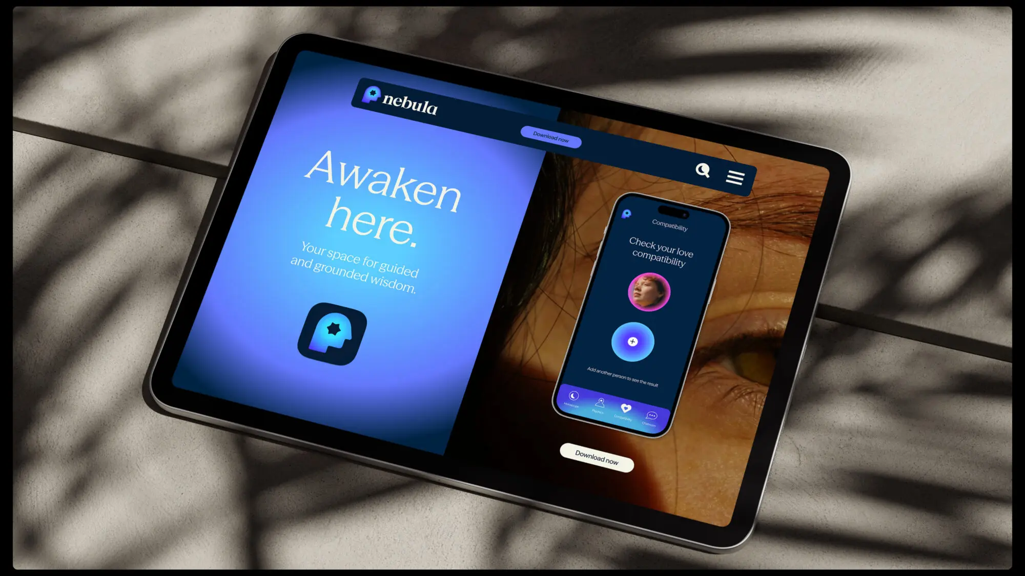
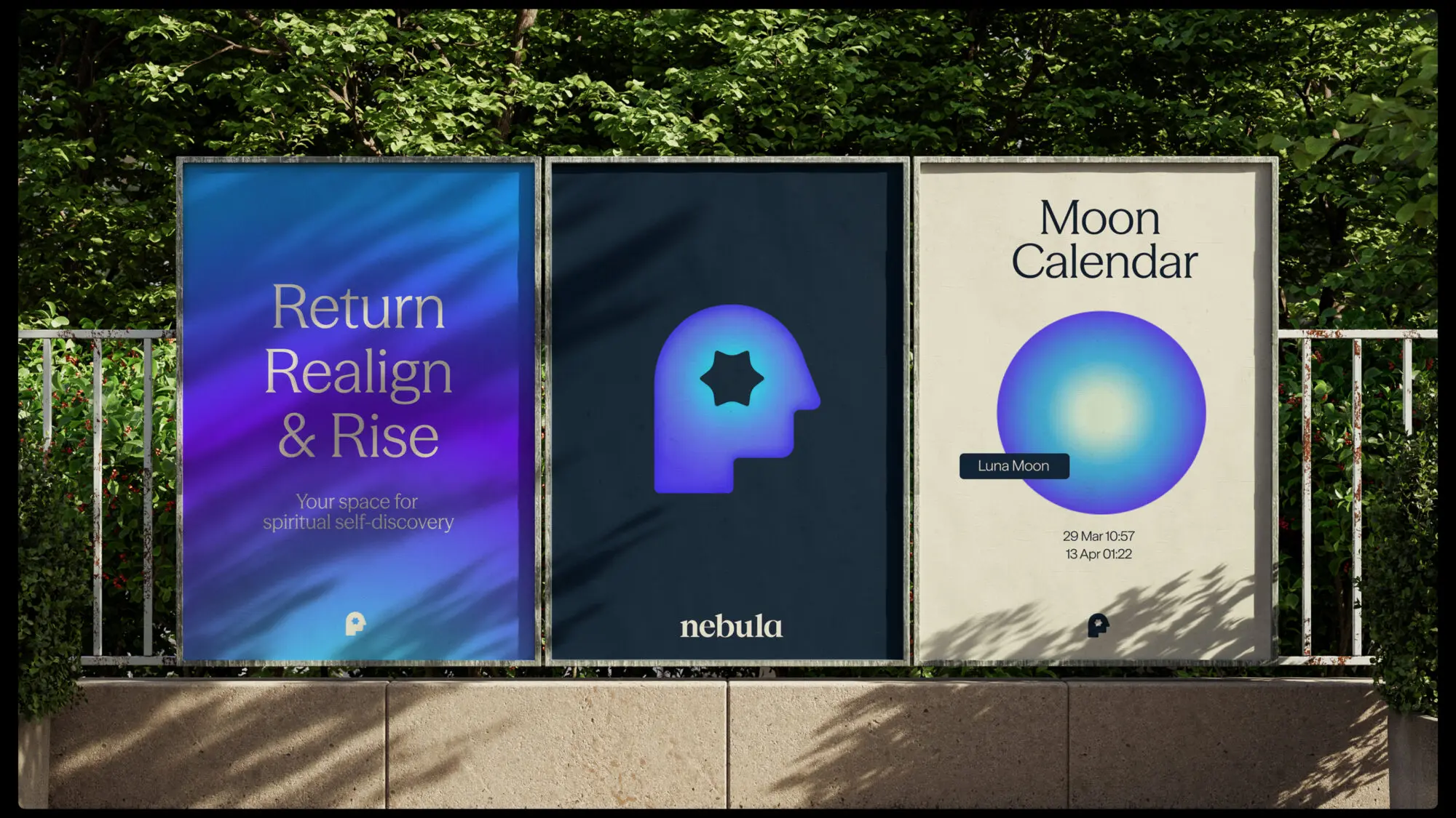
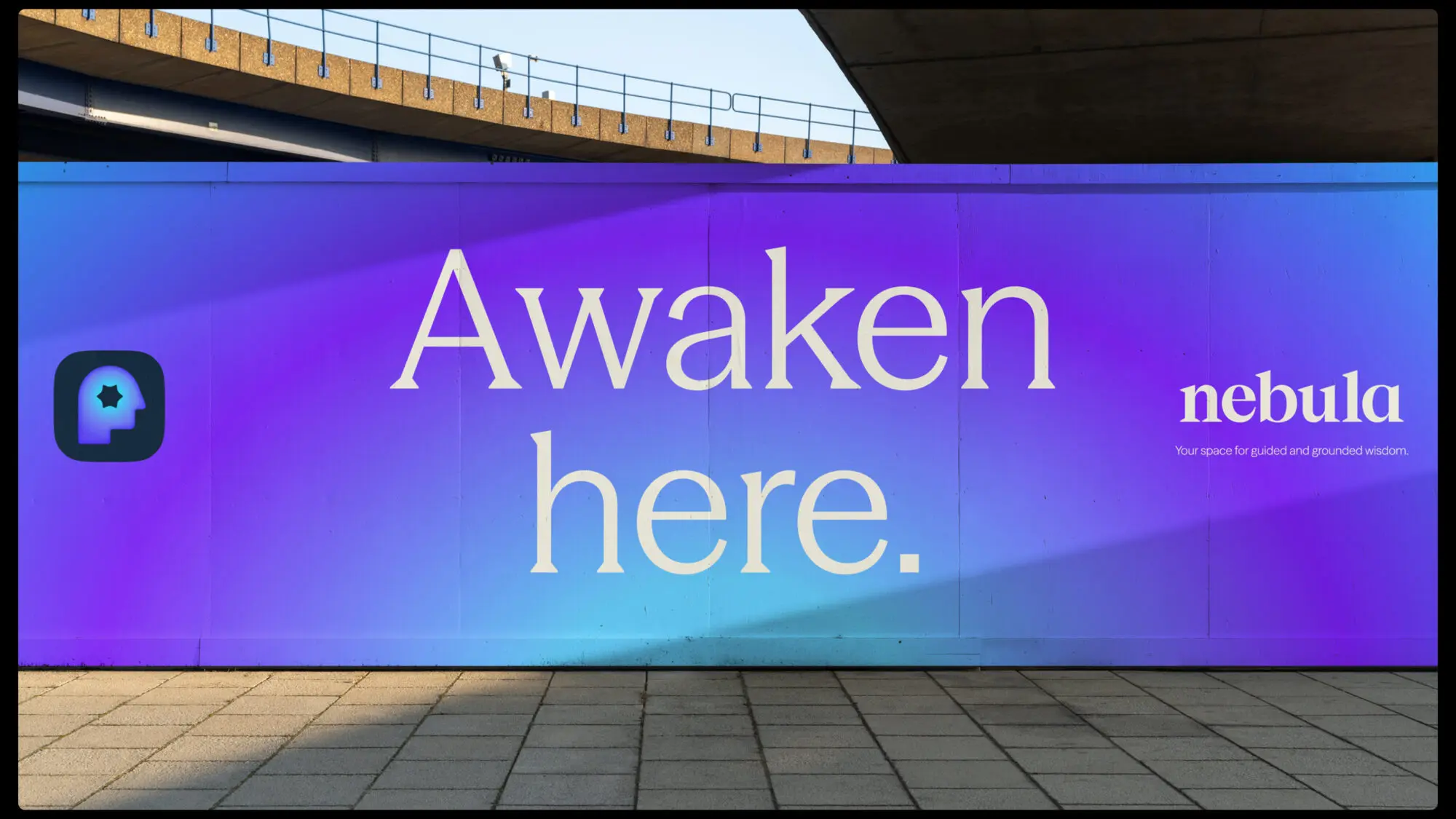
We repositioned Nebula as your space for spiritual self-discovery: a platform offering personalized tools and vetted expert guidance to help users feel clear, connected, and confident. Messaging pillars emphasized flexibility and access—Nebula is there whenever you need it—and guided, grounded wisdom that users can trust.