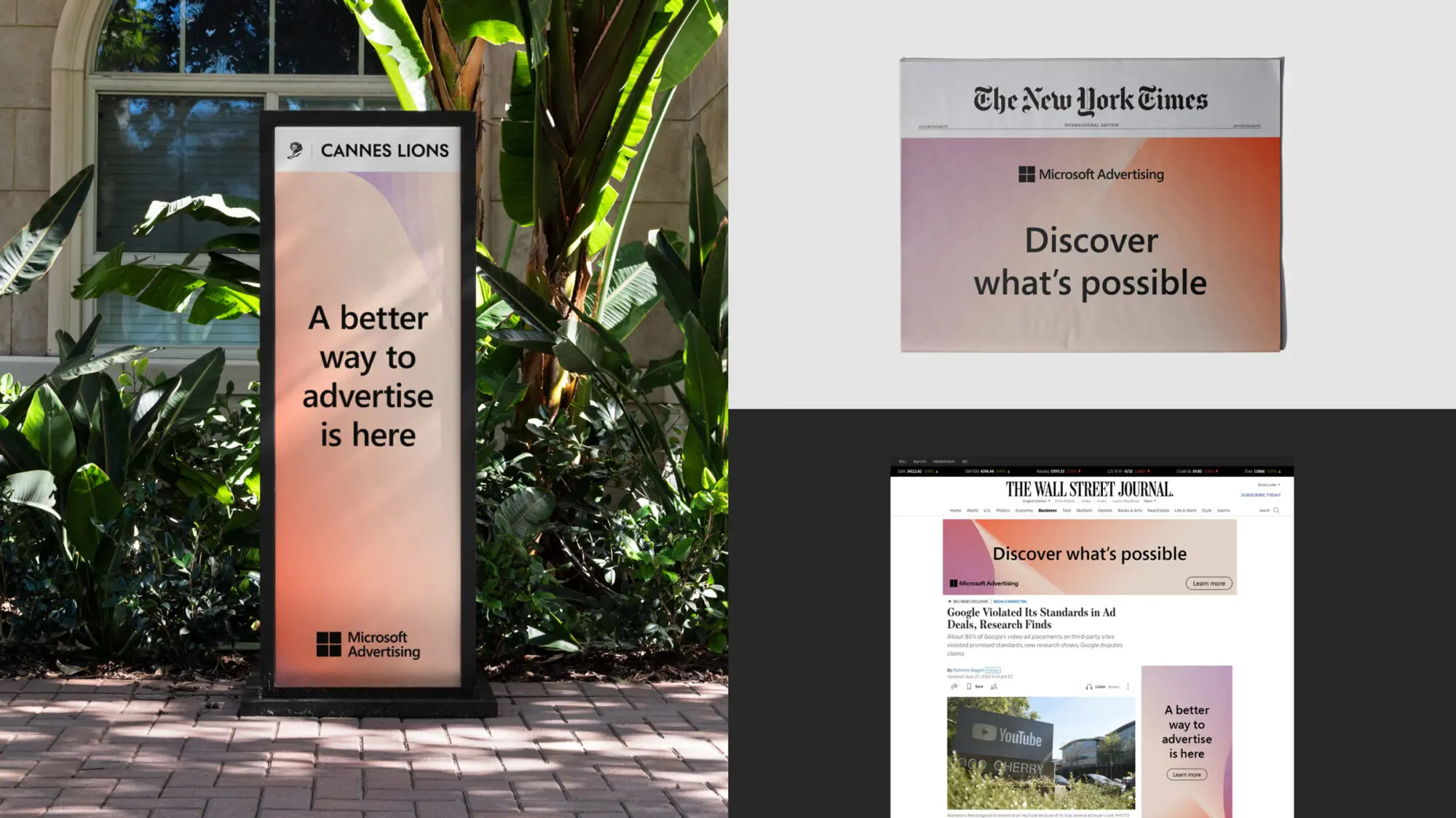
Bringing Transformation to life
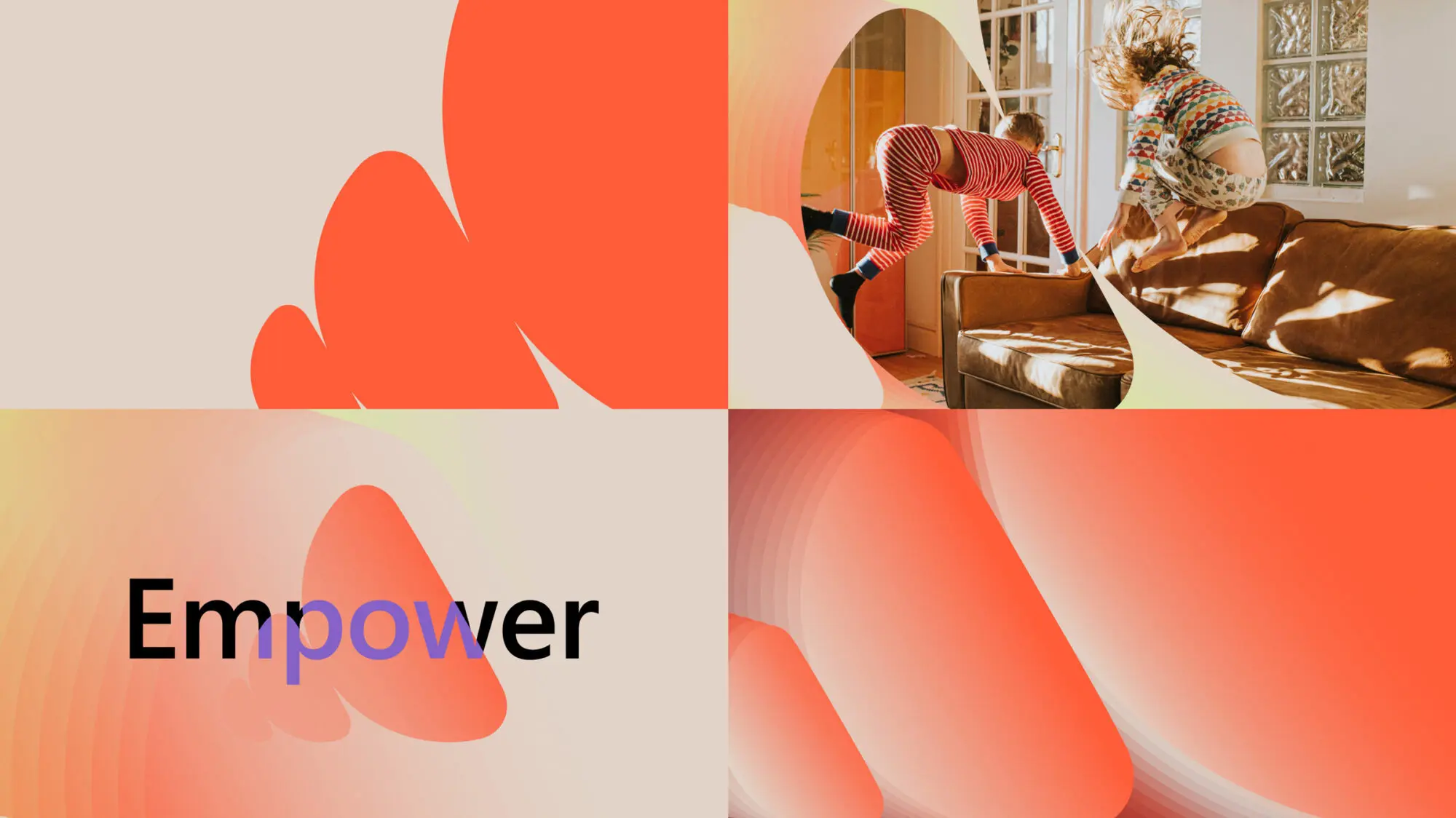
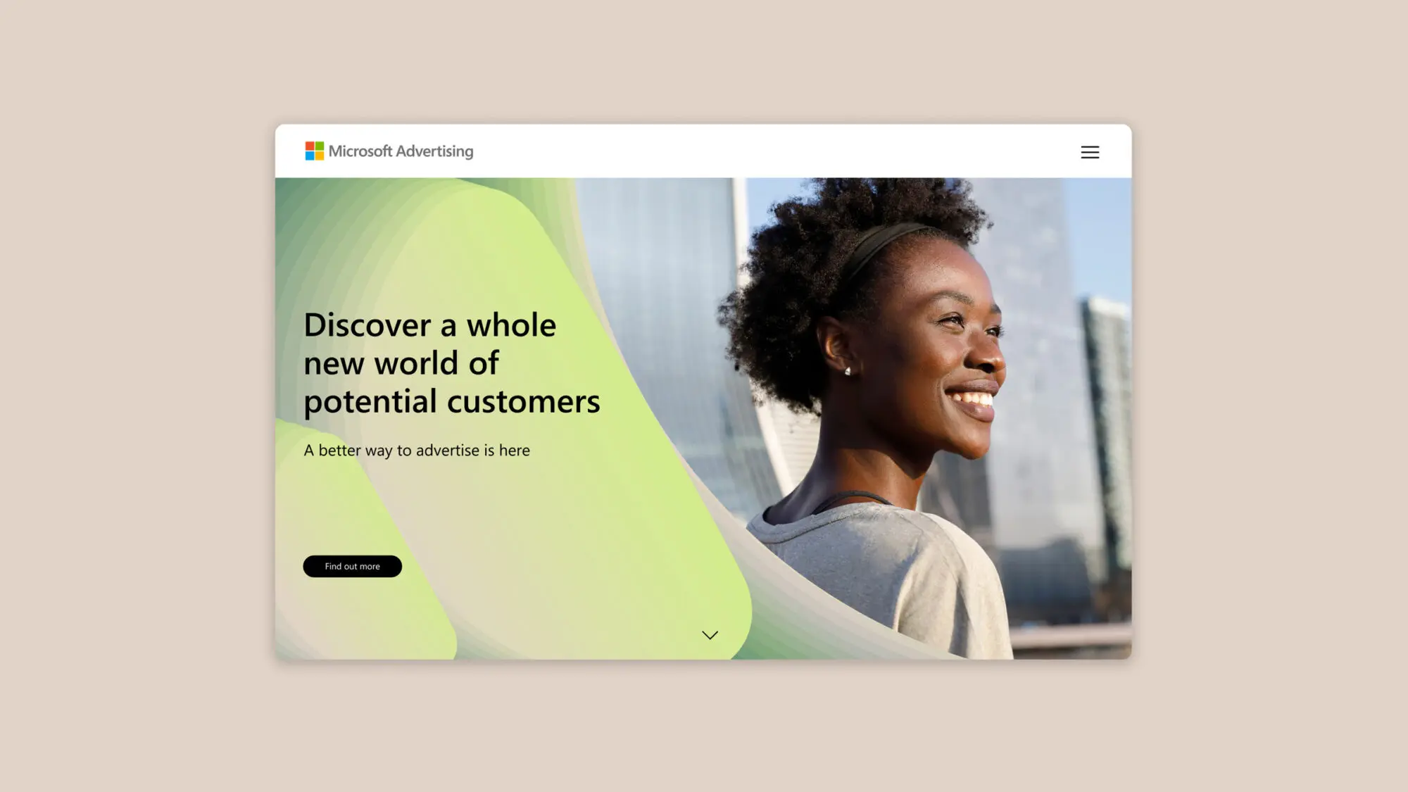
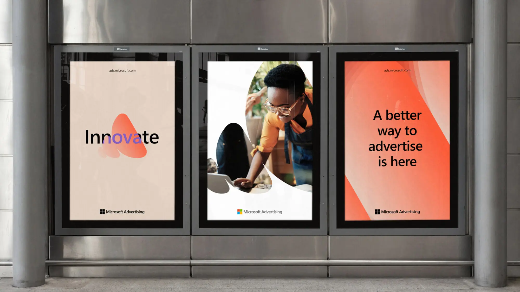
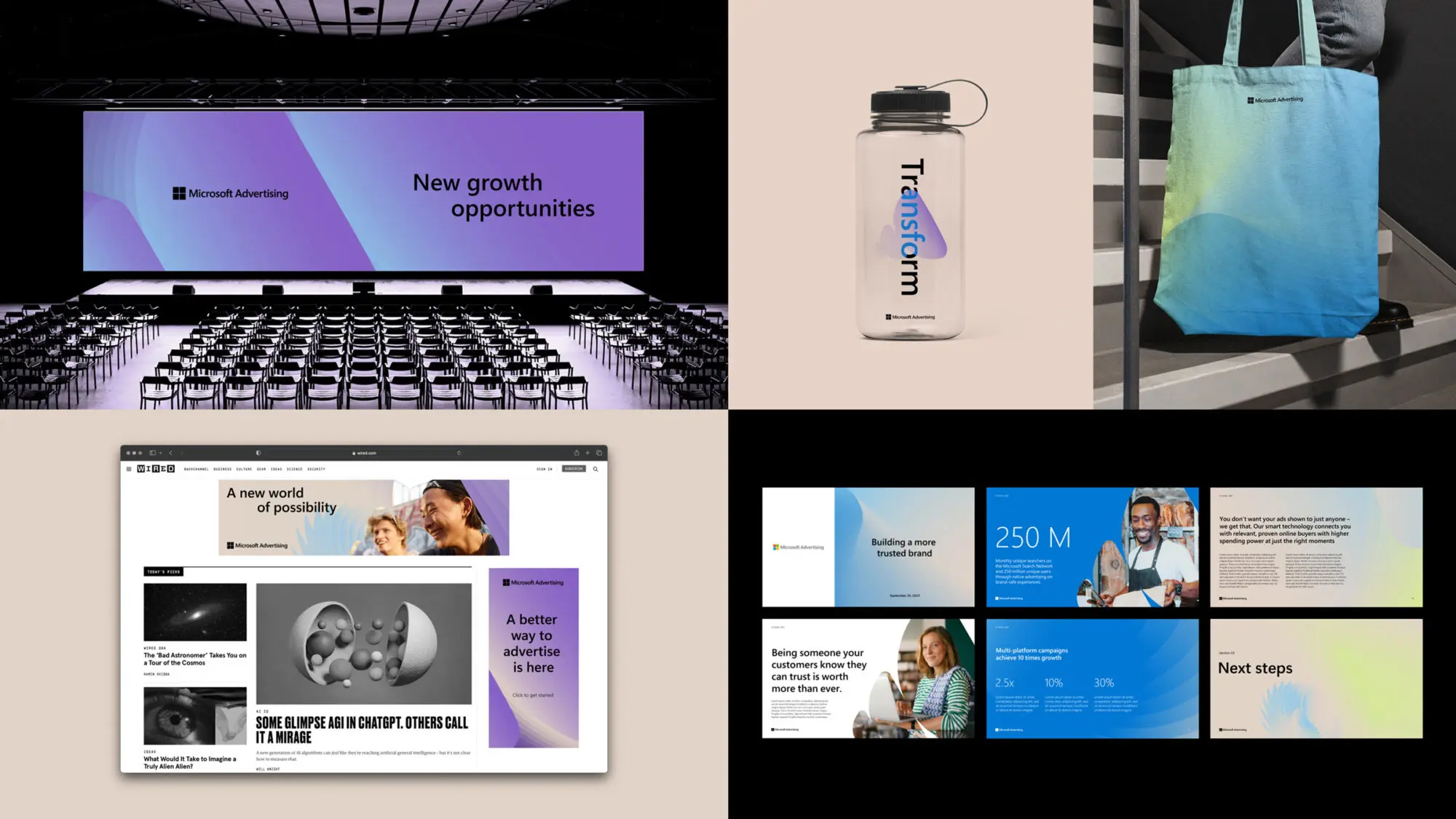
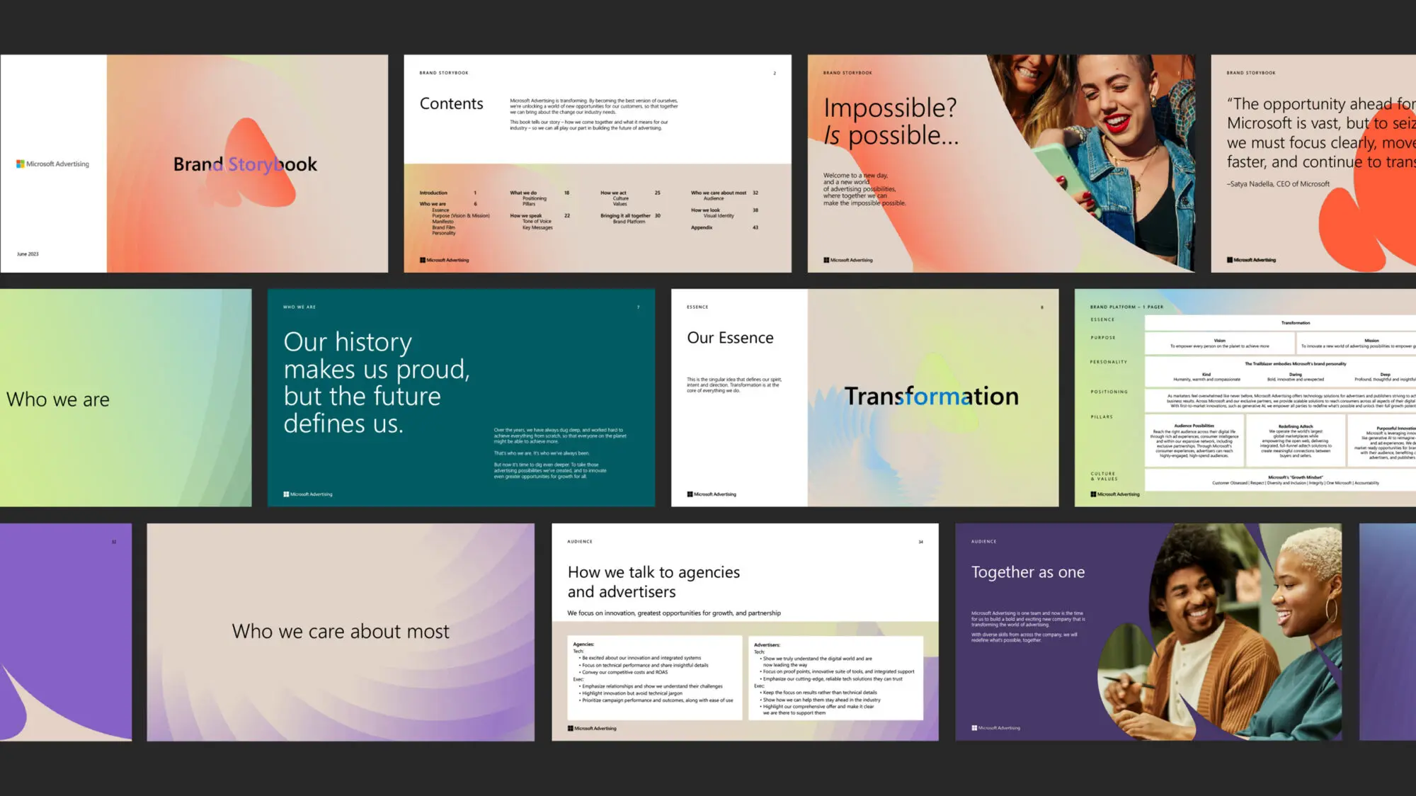
We developed an ownable visual system—creating a sub-brand rooted in the Microsoft parent brand while showcasing the individuality of Microsoft Advertising.
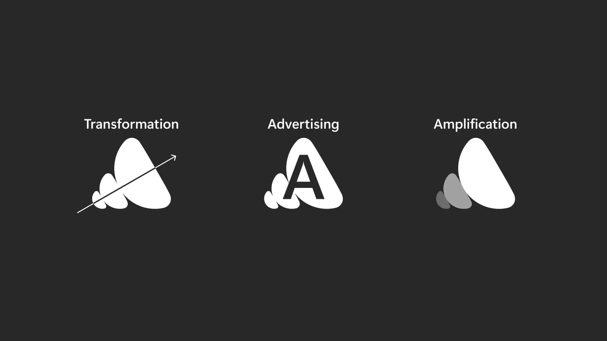
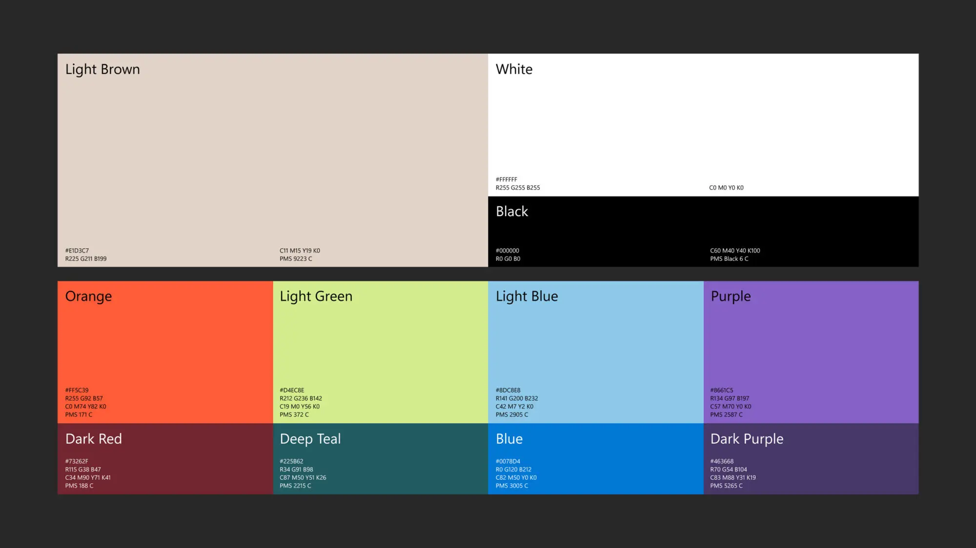
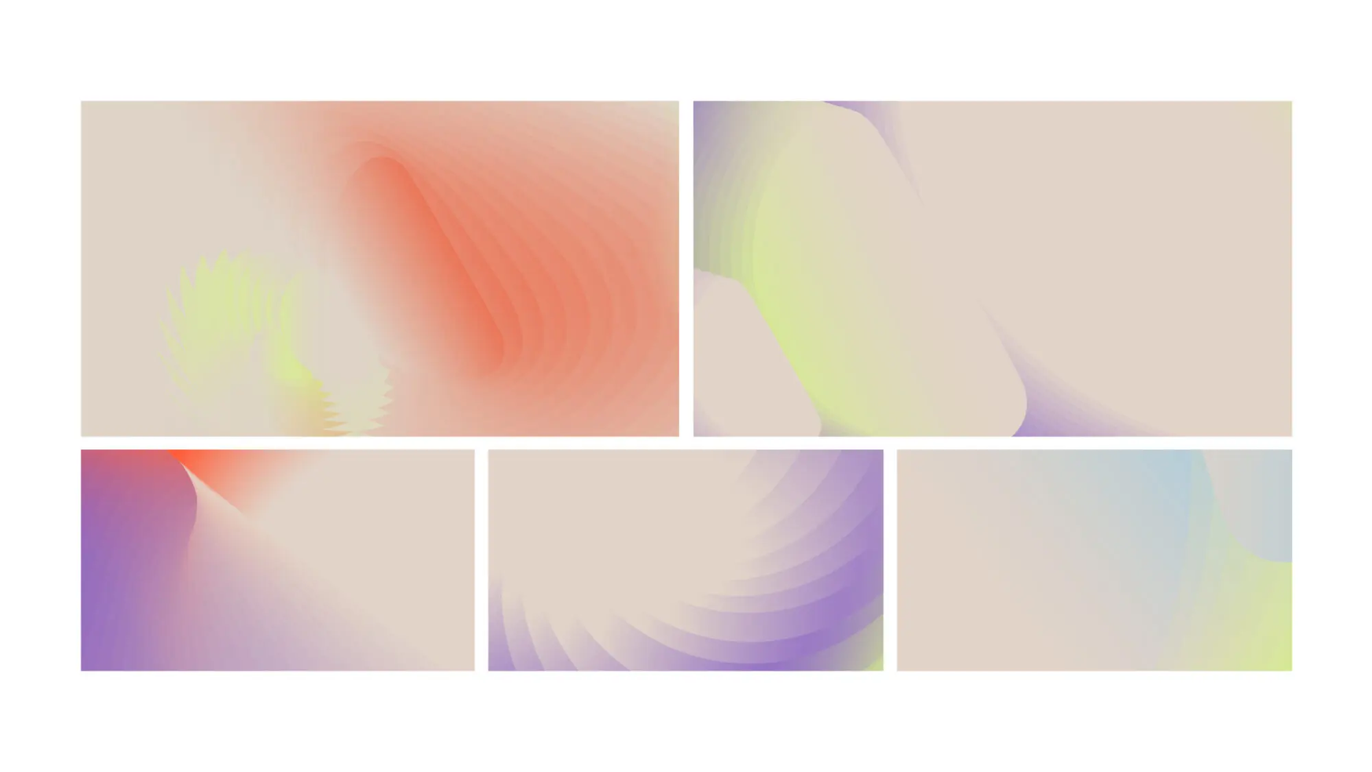
We anchored the visual identity to a three-piece graphic shape made of expanding sequential forms that reflected transformation—the amplification of advertising, growth and endless possibilities. While keeping the four-color Microsoft logo and typeface, we designed a non-centralized color system based on the Microsoft palette, enhanced with textures and unconventional hues.


