A hidden gem
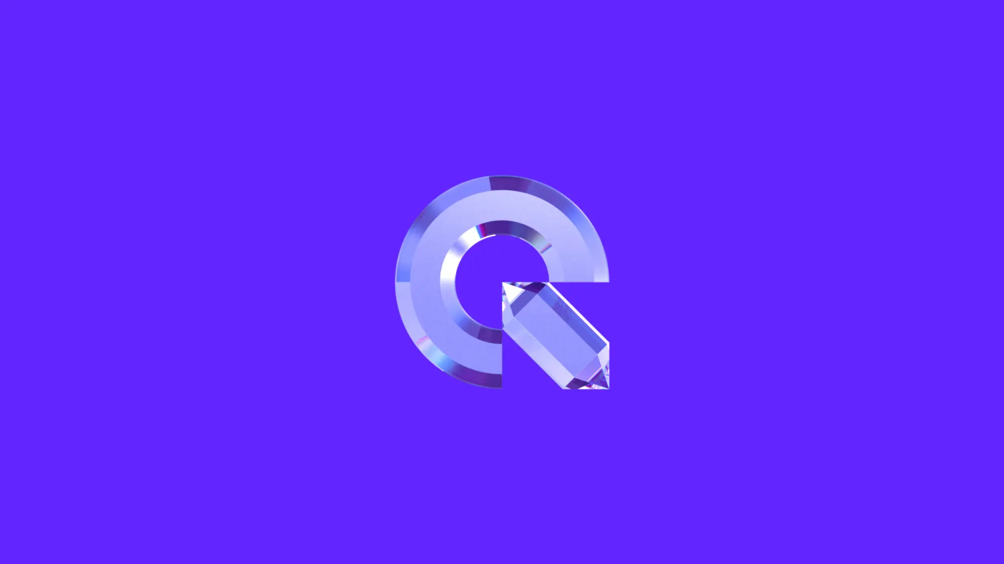
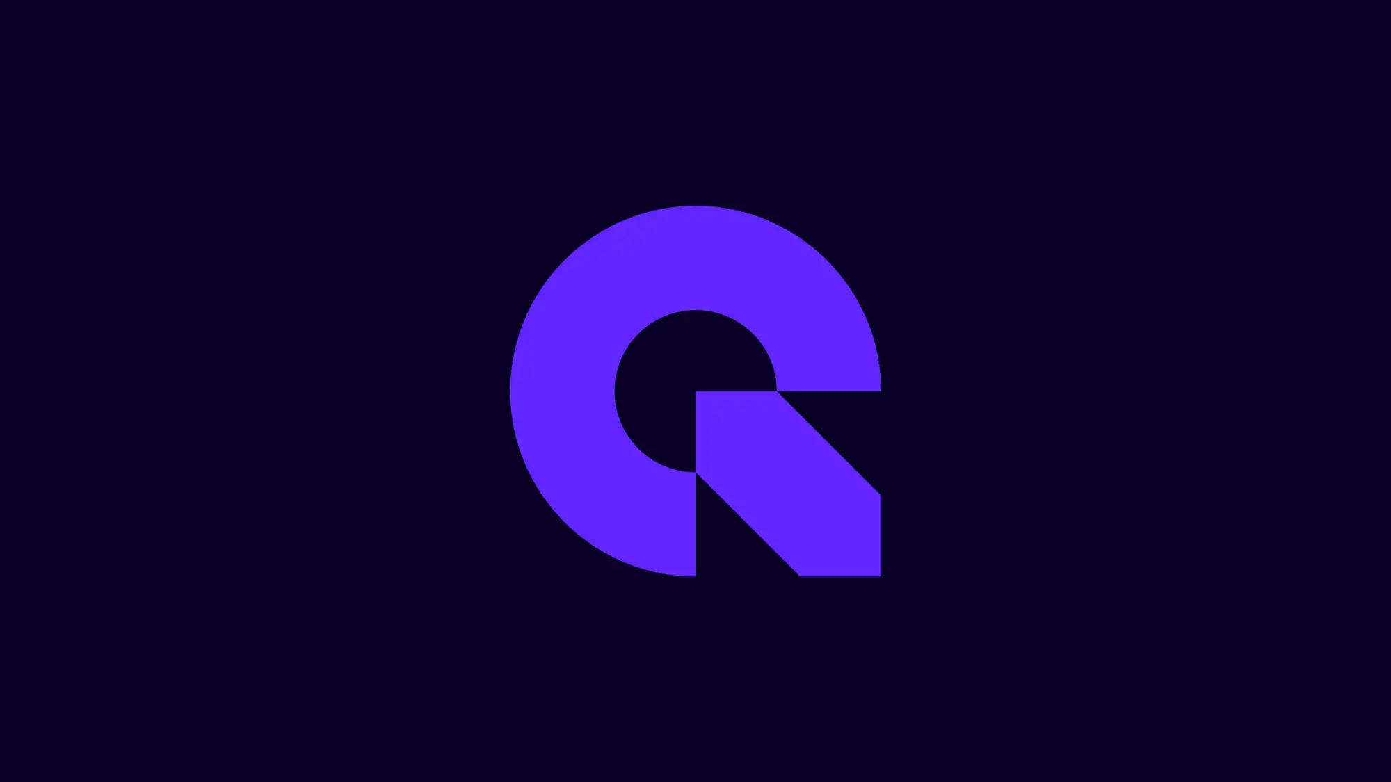
Combining a Q and N, we crafted a reductive and geometric mark. Hidden within it is the shape of a quartz crystal—an ownable visual cue for the brand and the foundation for the rest of the identity system.
Creating a premier brand with edge
Quartz Network is a business community for senior professionals. Through their events, content and online platform, they help ambitious people connect and grow.
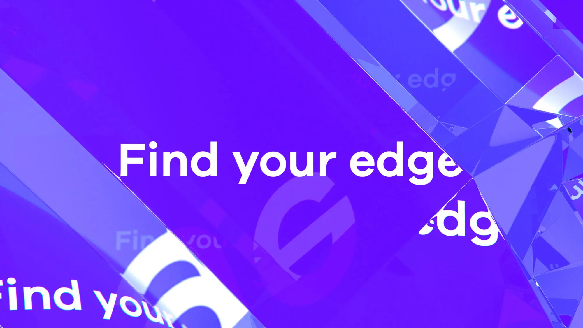
They needed a refreshed brand identity that reflected the drive and quality of executives within their network. Our strategic discoveries led to a new and aspirational brand story: ‘Find your edge.’ For their clientele, this means stepping outside of their comfort zone, allowing themselves to grow, and discovering their competitive advantage.
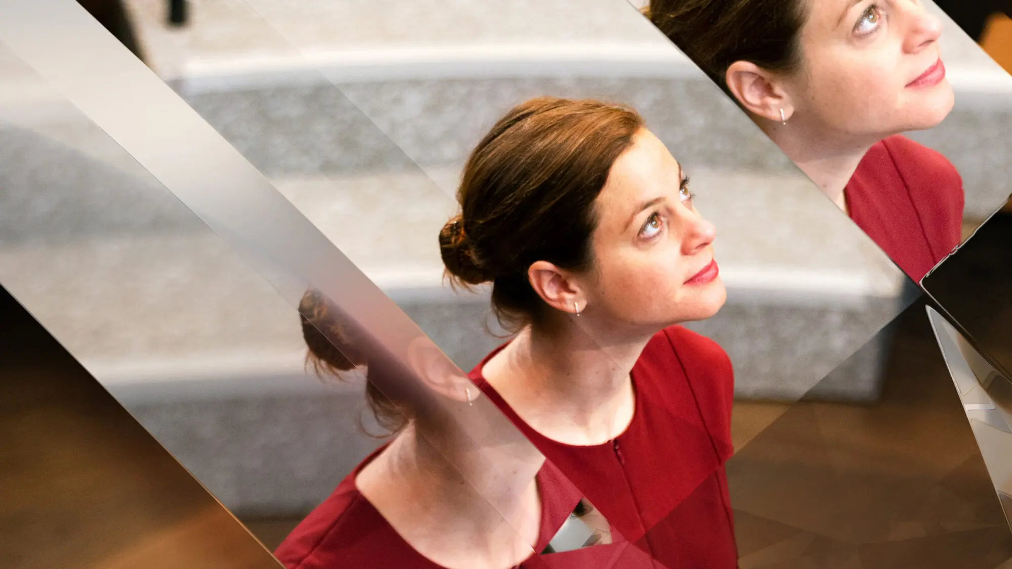
Combining a Q and N, we crafted a reductive and geometric mark. Hidden within it is the shape of a quartz crystal—an ownable visual cue for the brand and the foundation for the rest of the identity system.
Expanding on this graphic form, we created a quartz-like 3D treatment tool. The results bring the brand story to life through sharp and beautiful refractions in imagery and typography.
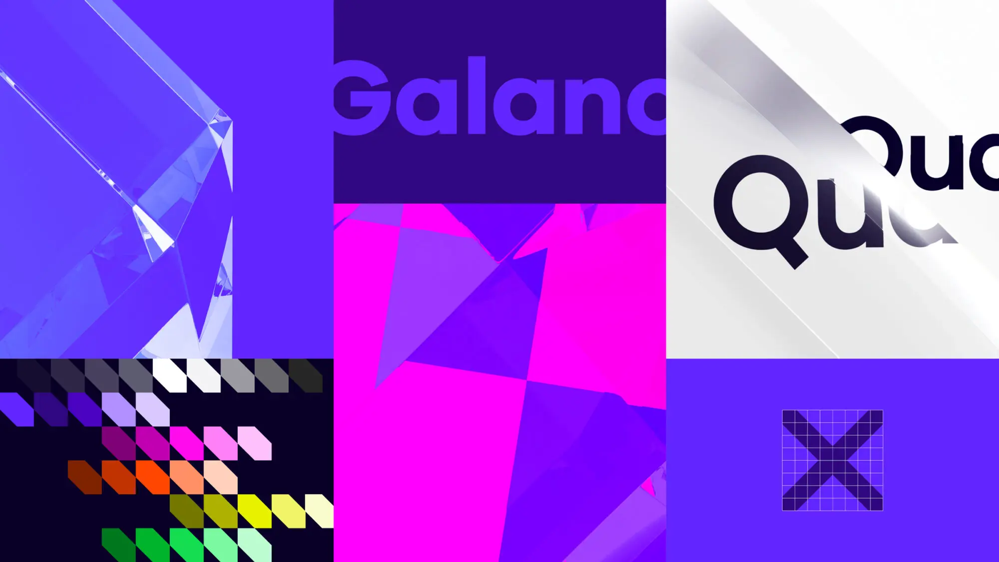
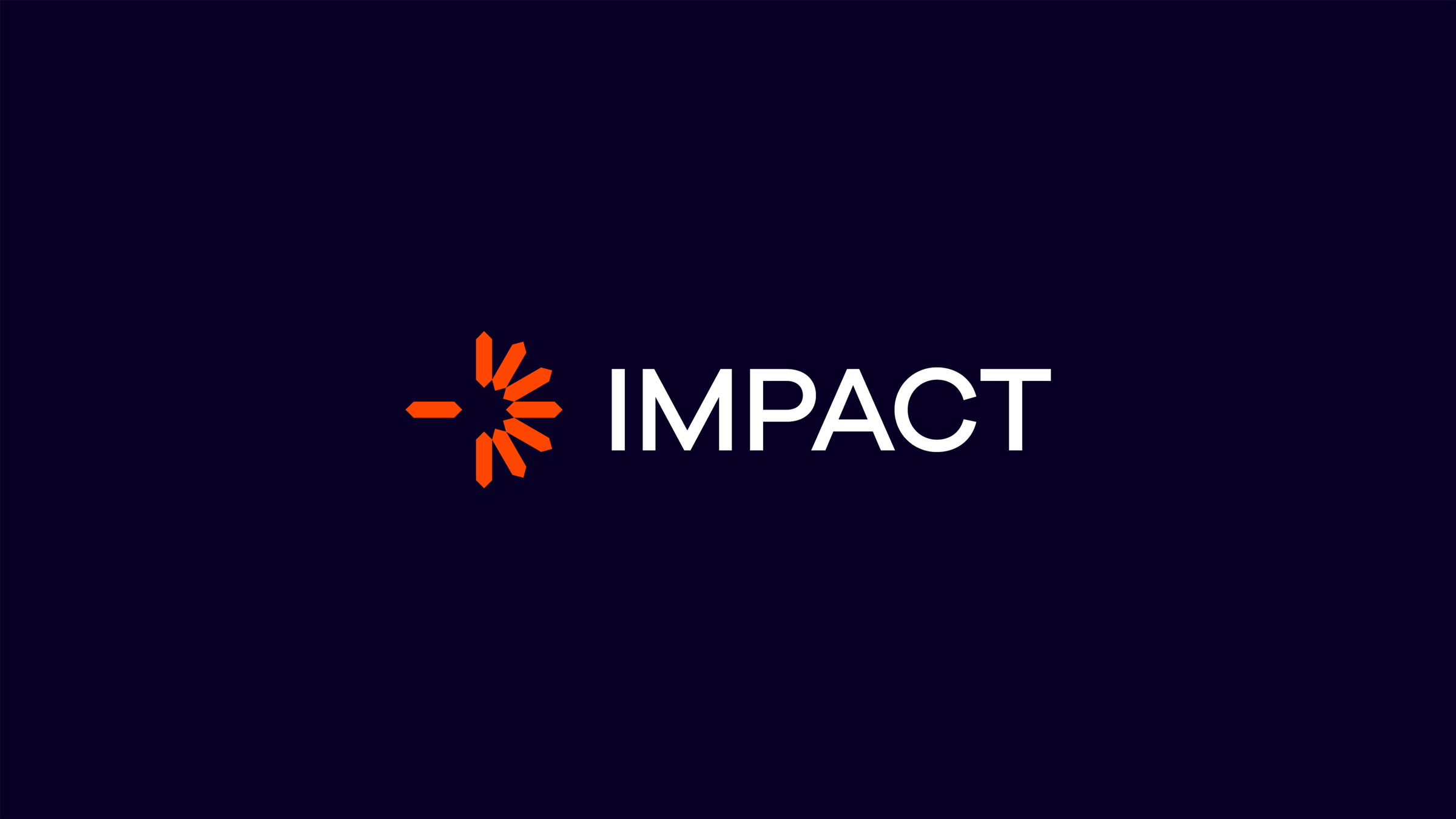
By defining Quartz Network’s brand architecture, we brought clarity to their variety of event categories. Four sub-brands were designed, with unique logos, graphic expressions, and vibrant color palettes.
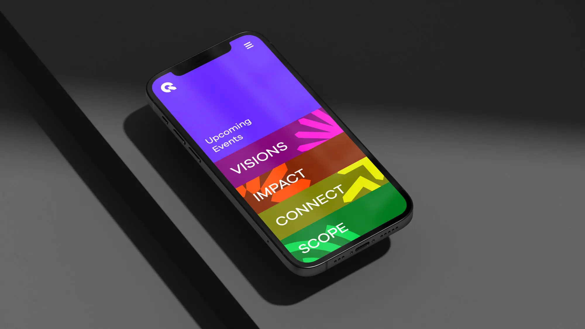
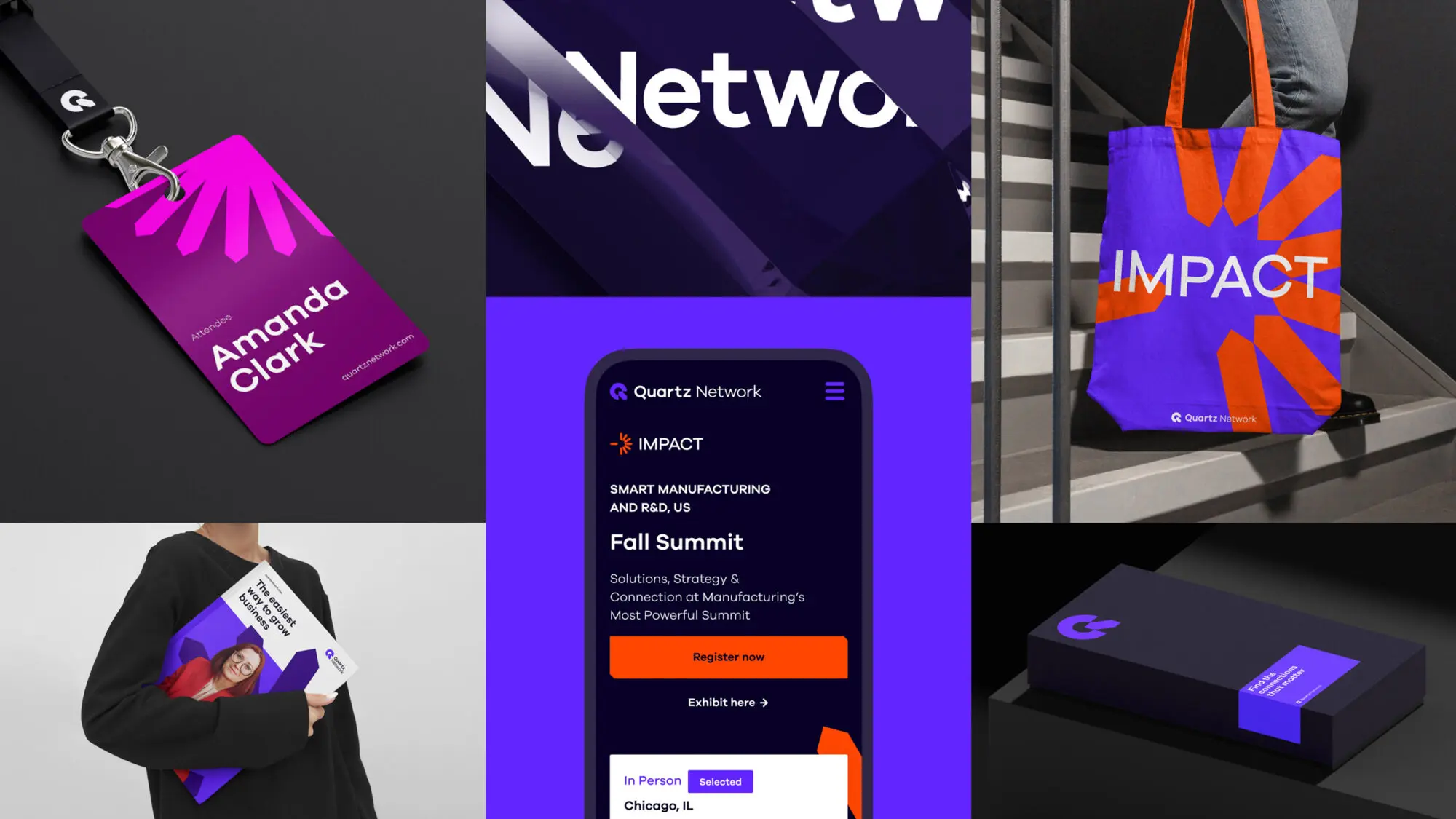
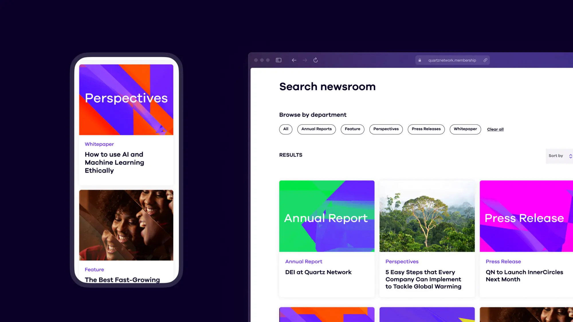
To bring the new brand and messaging to life, we created a modern and immersive web experience, including UX, UI, and a design library using atomic design principles.