Impactful brand story

Building from the concept and value proposition ‘where work actually flows’, we created a brand story that conveys the Budibase personality and heroes their customers – IT teams – while highlighting the impact they can achieve together.

A vibrant symbol imbued with meaning

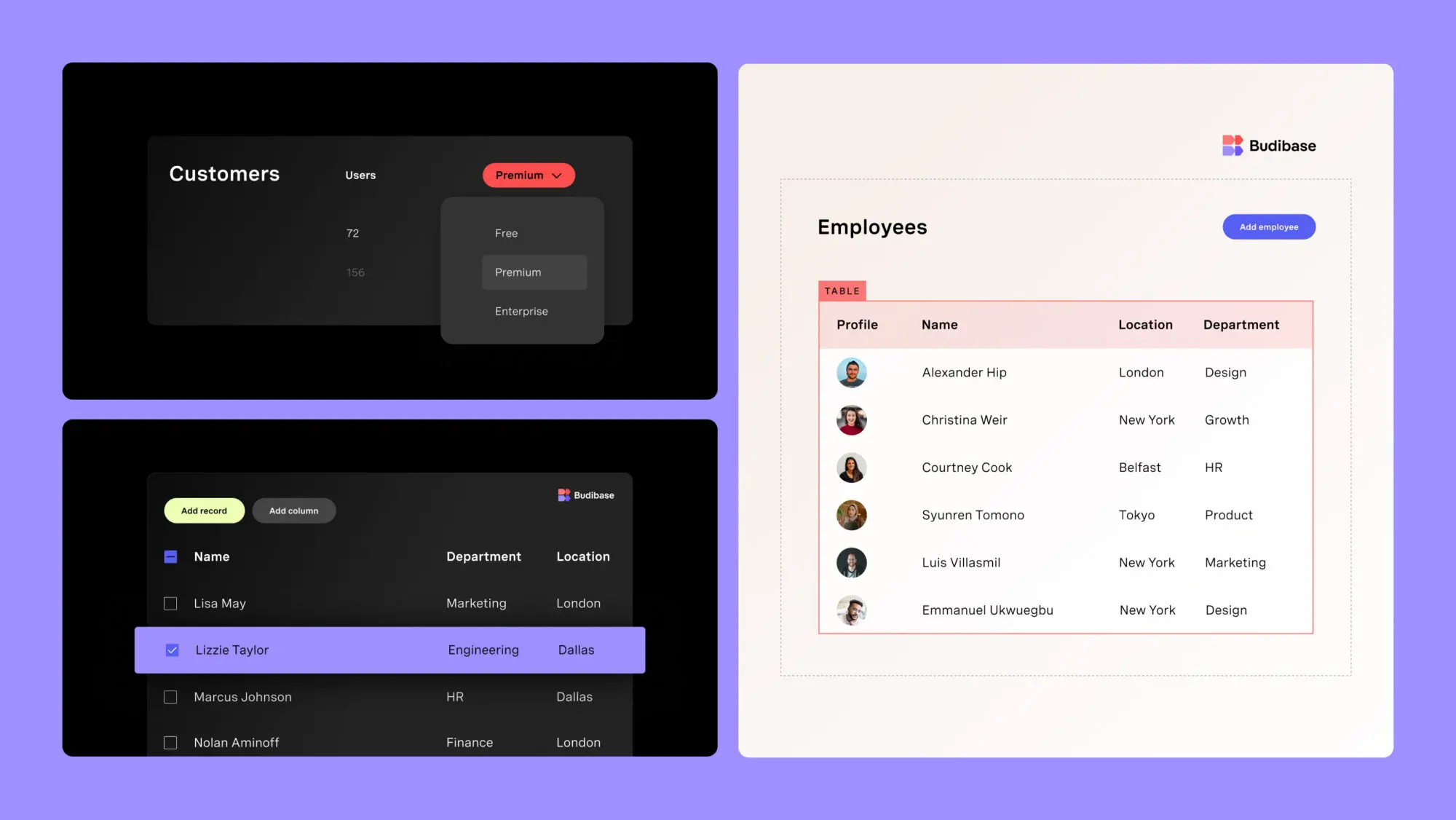
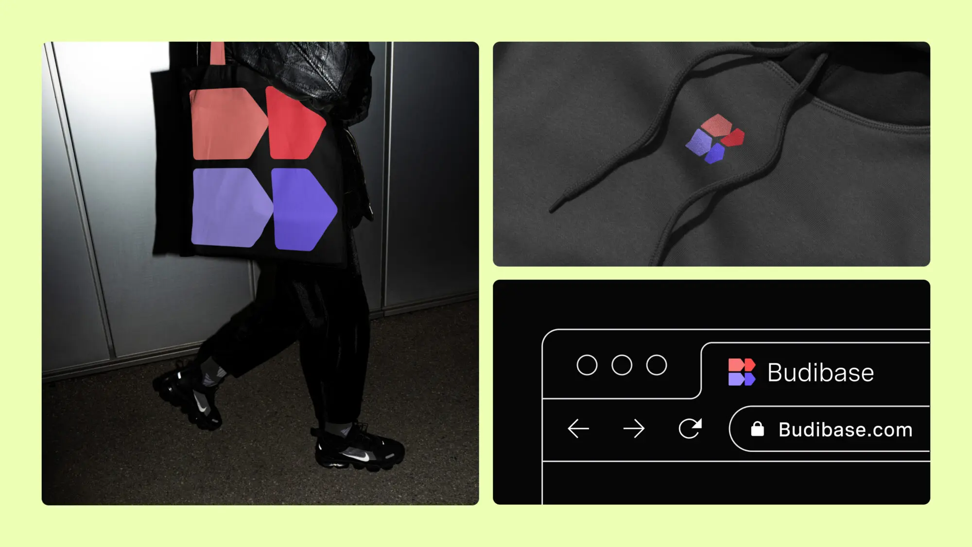
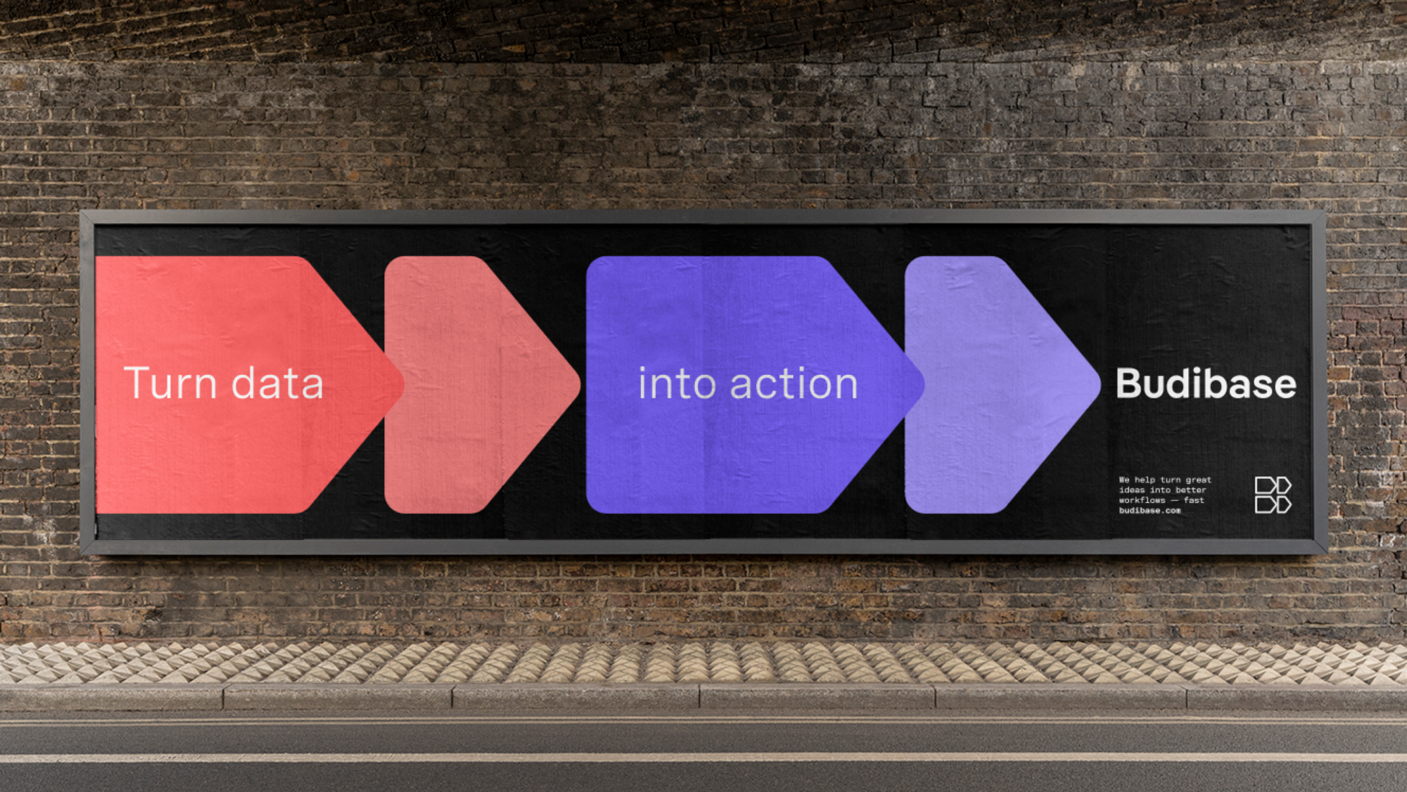
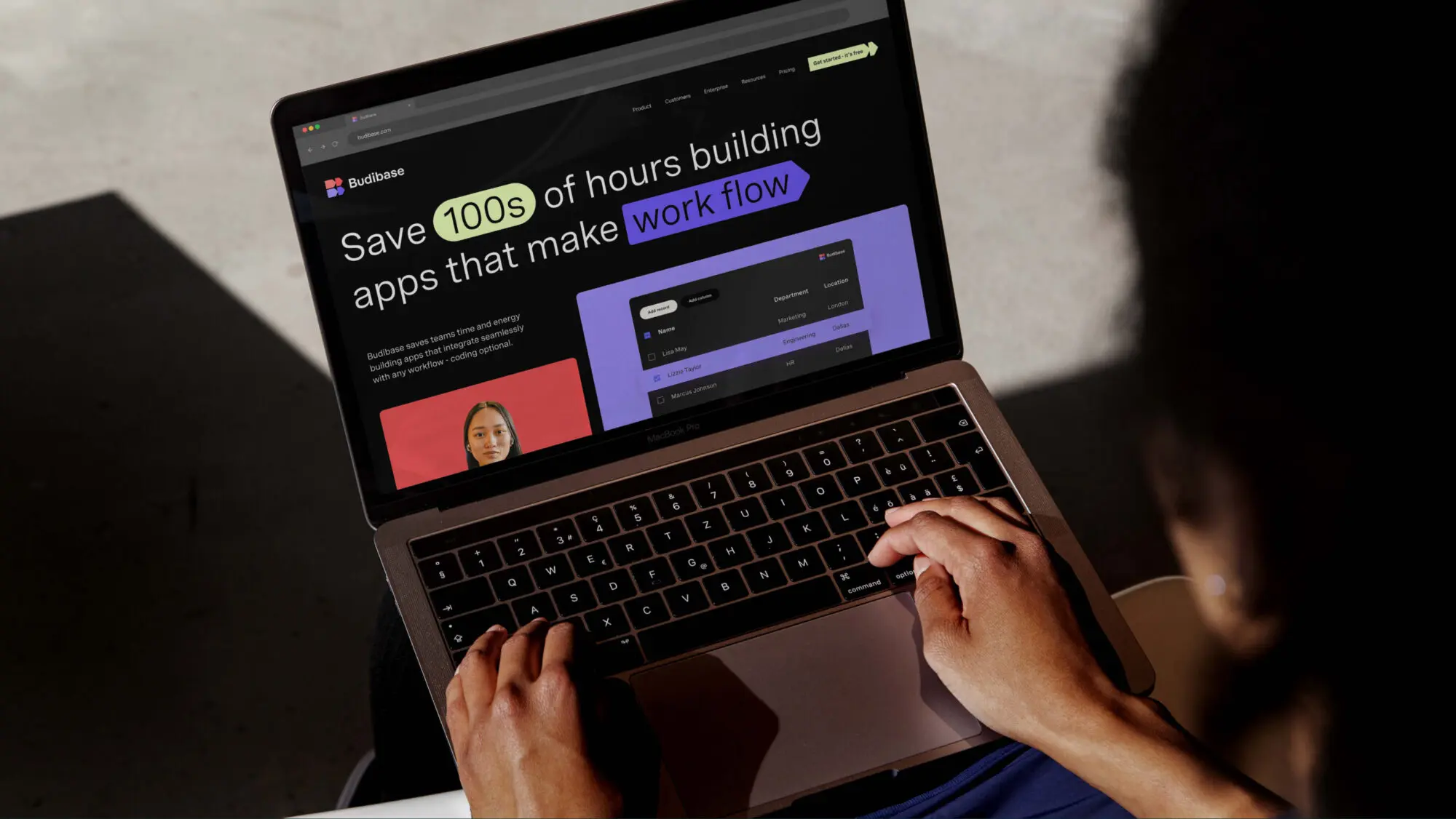
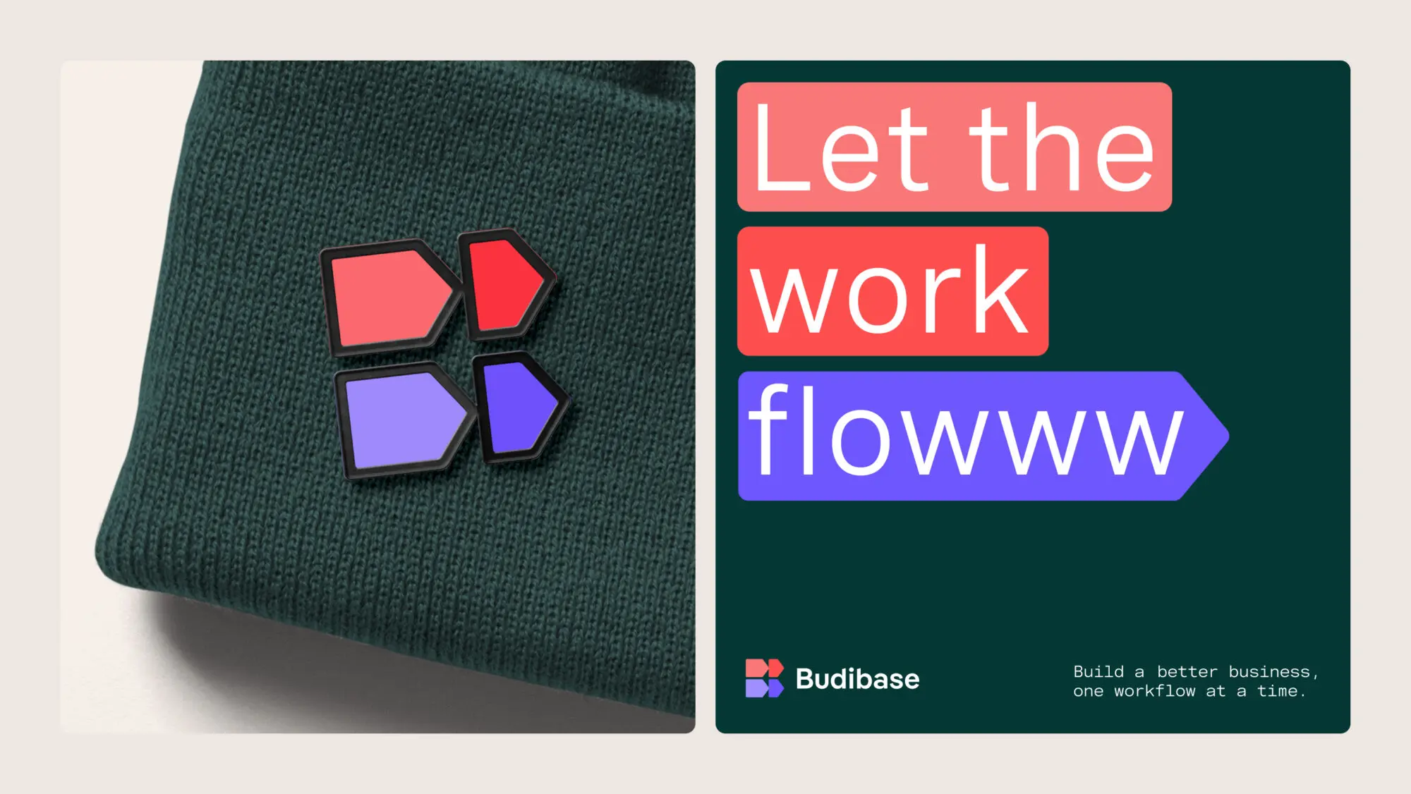
To bring this story to life, we created a visual identity that reflects Budibase’s game-changing role in supercharging productivity.

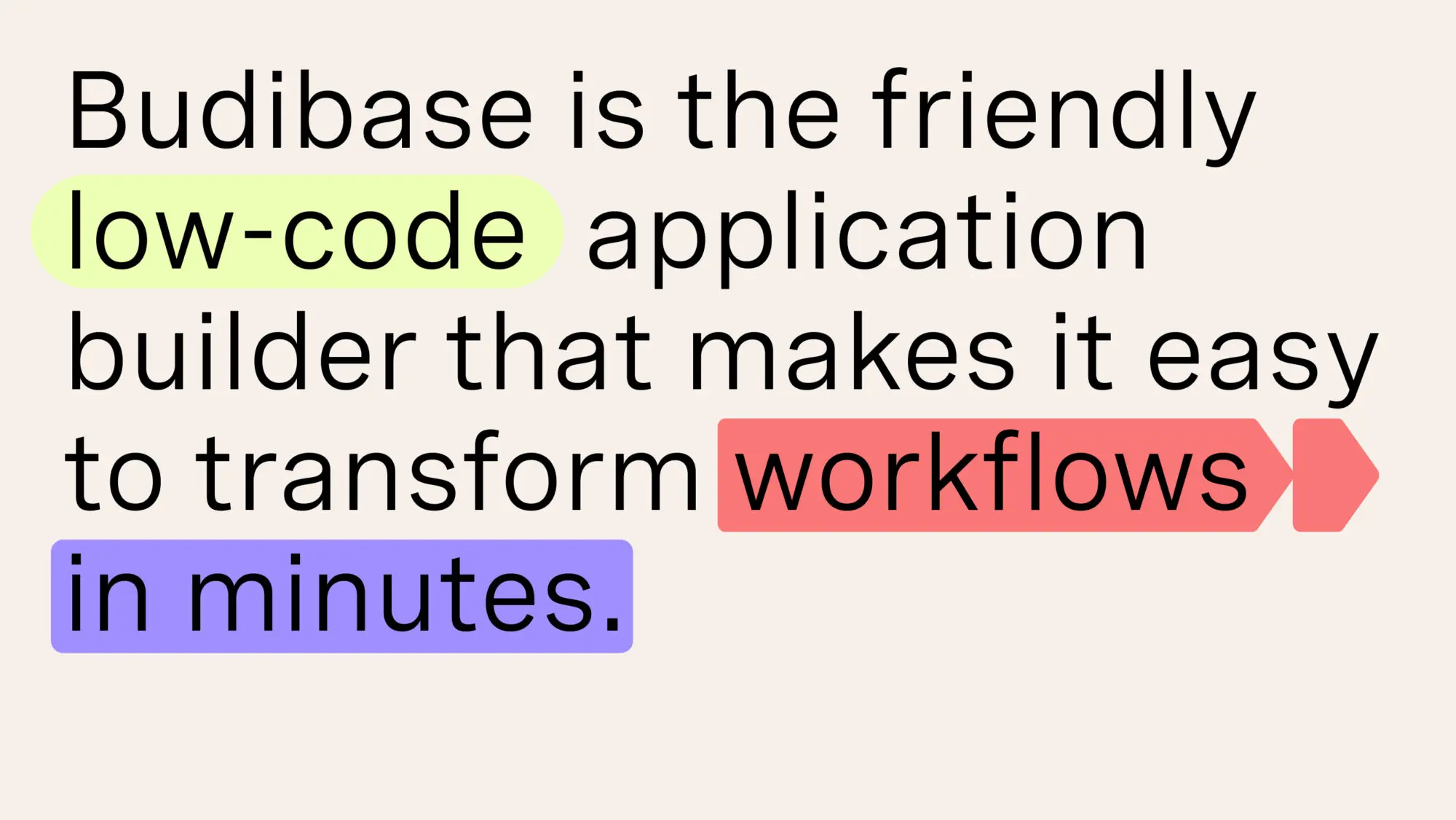
Our primary focus was developing a distinctive and meaningful logo. Our symbol draws on the distinct visual language of workflow diagrams, made up of arrows, shapes and labels while referencing the building blocks of code that Budibase provides. Above all, it conveys energy and acceleration – a nod to the development of internal tools and automated workflows that drive businesses forward at pace.

Standing out from the crowd

Emblematic of the Budibase brand, these ideas come together to create their signature double B symbol. The lively colour palette stands out in a market lacking variety and spirit, adding the human warmth implicit in their name.

‘In setting out to create a new logo, we knew we wanted to capture the spirit and value of Budibase in a simple, iconic, creative form—a symbol that would represent workflows for many years to come. We partnered with Moving Brands to find that symbol and couldn’t be happier with the outcome. From strategy workshops to fine-tuning our new wordmark, they went above and beyond what we expected and we'd confidently recommend them to other companies considering a rebrand.’
Joe Johnston
Co-founder, Budibase