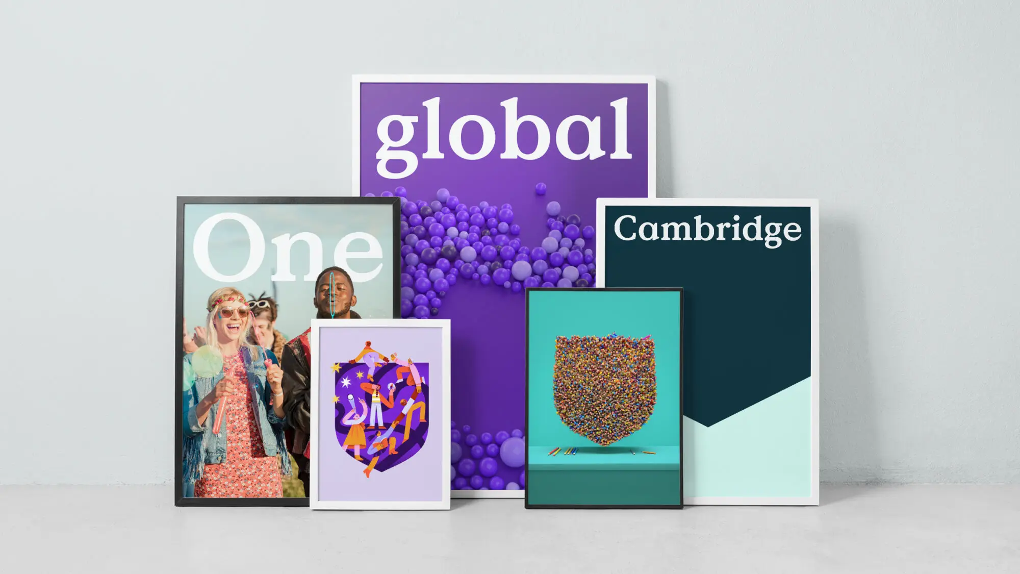
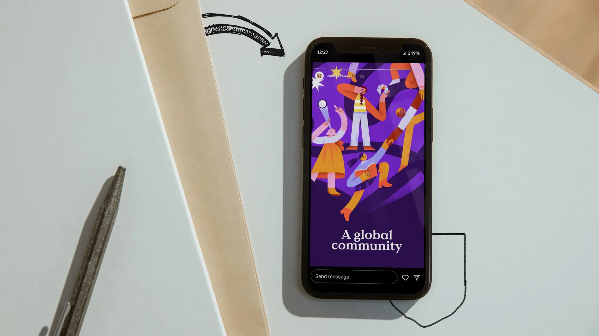
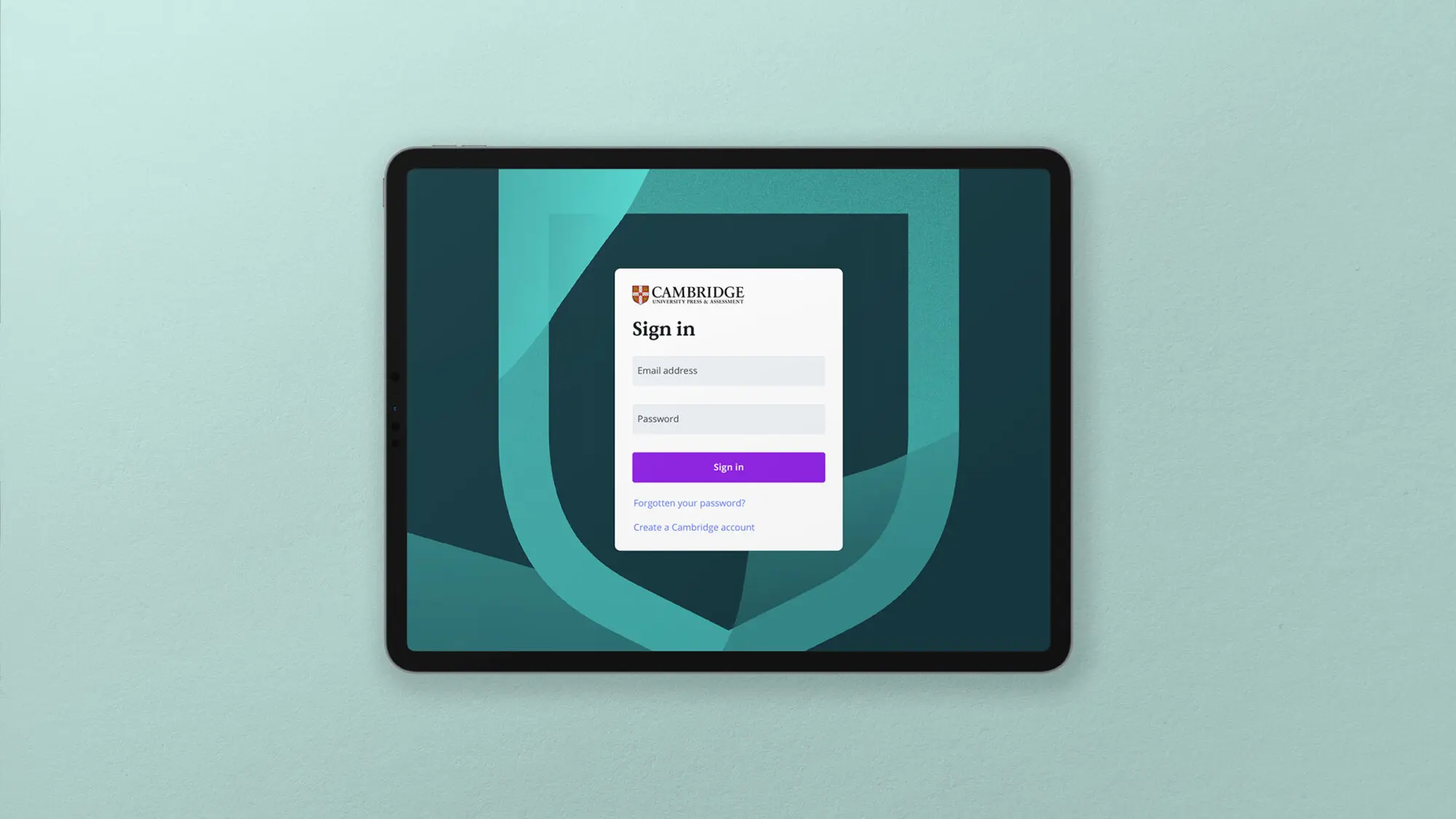
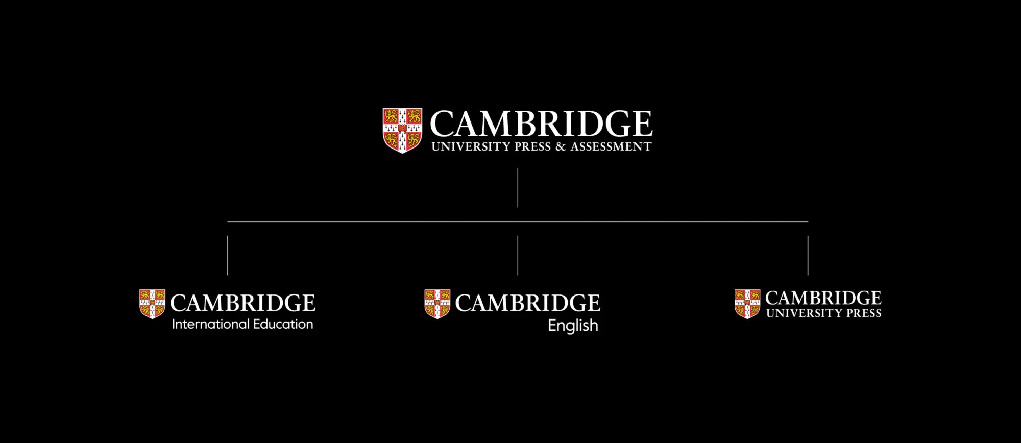
A unified identity

It all started when Cambridge University Press and Cambridge Assessment merged to form Cambridge University Press & Assessment – a global organisation operating in 130 countries – and asked us to be their partner in this major strategic move.

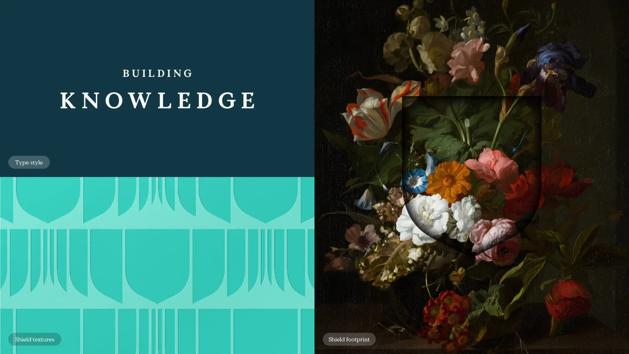
The challenge was to combine two separate brands – with distinct strategies, tone of voice, and visual branding – into a system that would effectively express this unified identity.

Creating ‘One Global Cambridge’

With our strategic guidance, Cambridge also established a simplified brand architecture, placing relevant sub-brands, products and services within the Cambridge University Press & Assessment brand.

Overall, we defined a strategy of ‘One Global Cambridge’ that leveraged the force of all Cambridge organisations and their unique cultures and heritages. Underpinning this strategy is the unifying Cambridge shield, a first-of-its-kind coat of arms from 1534 but reimagined to speak to the present-day organisation’s limitless opportunities and offerings.

A driving force of the merger was to create 
a cohesive brand system whilst allowing for each sub-brand within Cambridge University Press & Assessment to have unique assets. 
A fixed, flexible and free system enables the brand to present itself consistently, but with room for products and services to be tailored to suit the audience and communication.

Tailoring sub-brands to the audience

Over the following two and a half years, Moving Brands has worked with business units across Cambridge University Press & Assessment to build on our foundational work, working with each sub-brand to adapt and showcase their individual personality and offerings while staying true to the parent brand. Our partnership remains ongoing.

Cambridge English

We partnered with Cambridge English to create a distinct and compelling brand identity. Rooted in the excellence of the University of Cambridge, Cambridge English goes beyond teaching English, empowering millions worldwide to grow personally and professionally. Working closely with the Cambridge team, we embodied this powerful truth in a new brand promise, “where your world grows”. We developed a design language that brings this promise to life and designed a multiplatform campaign to inspire and engage new and existing audiences.

Cambridge University Press

The leading global publisher asked us to help refine their tone of voice to resonate more deeply with diverse audiences worldwide and refresh their visual identity to reflect their ethos. Our redesign artfully blends heritage with innovation, emphasising the iconic “Cambridge Blue” and pairing it with bold red to ensure the brand remains vibrant and contemporary without projecting elitism. We designed shield textures to flex according to the context and target audience, thus ensuring every communication is both unique and unmistakably “Cambridge”.