The Cinereach brand story, which reads:

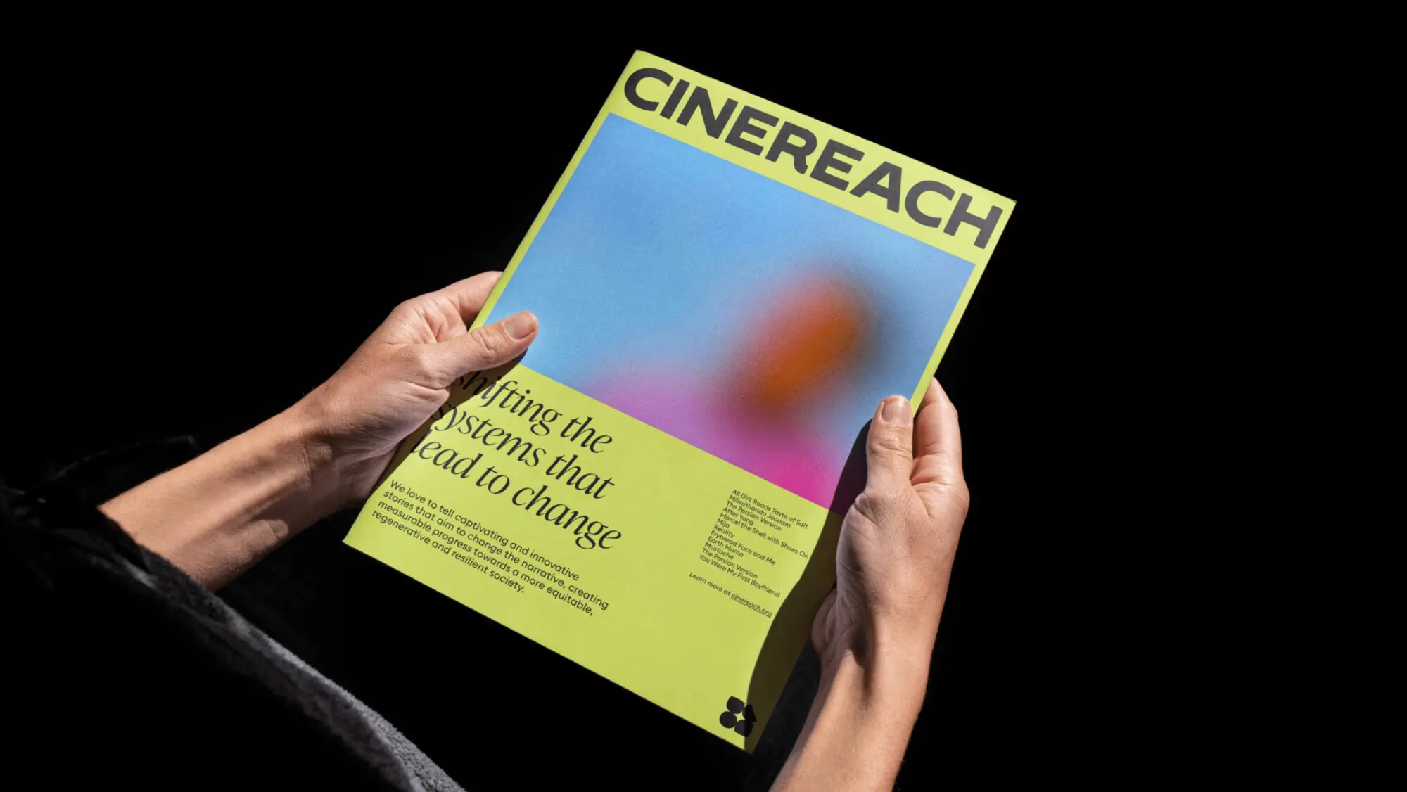
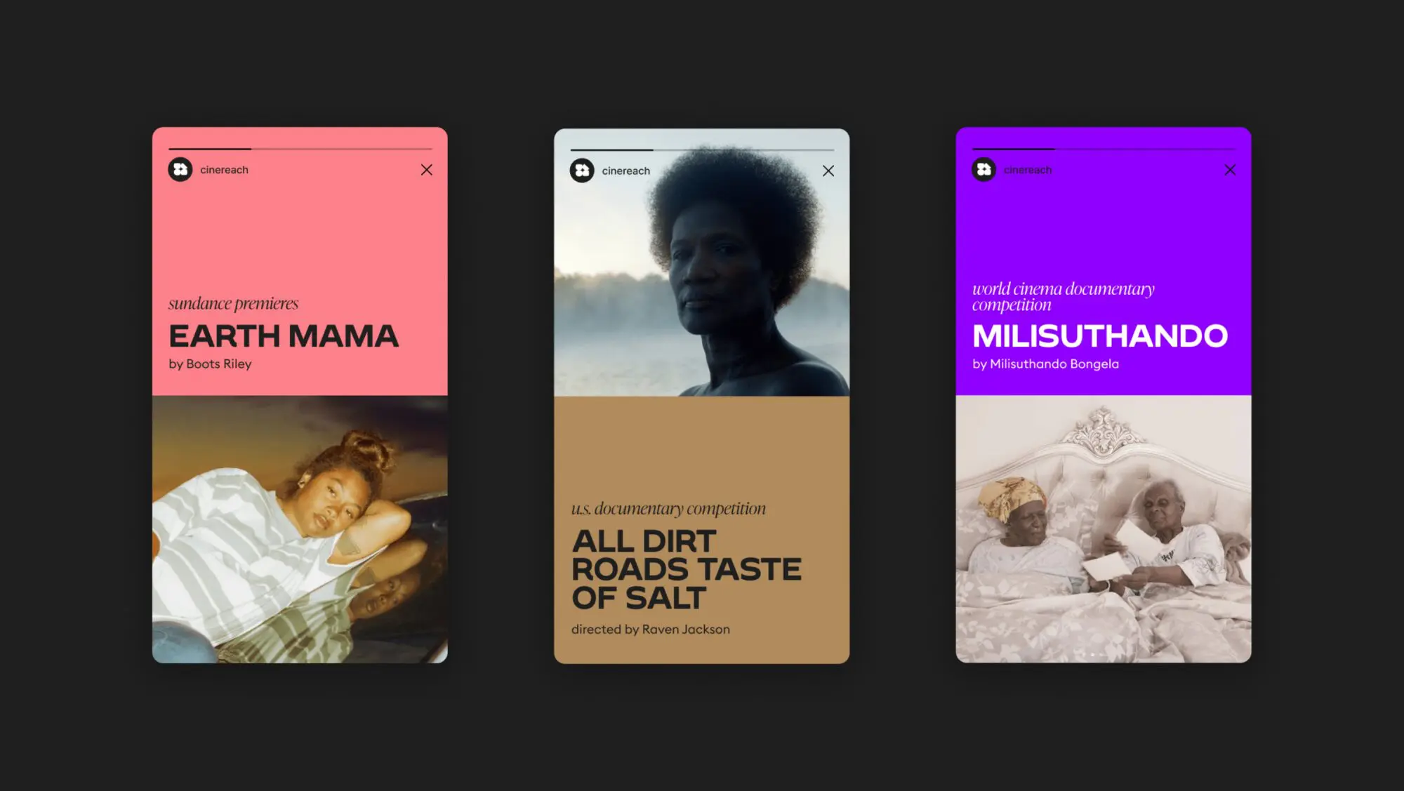
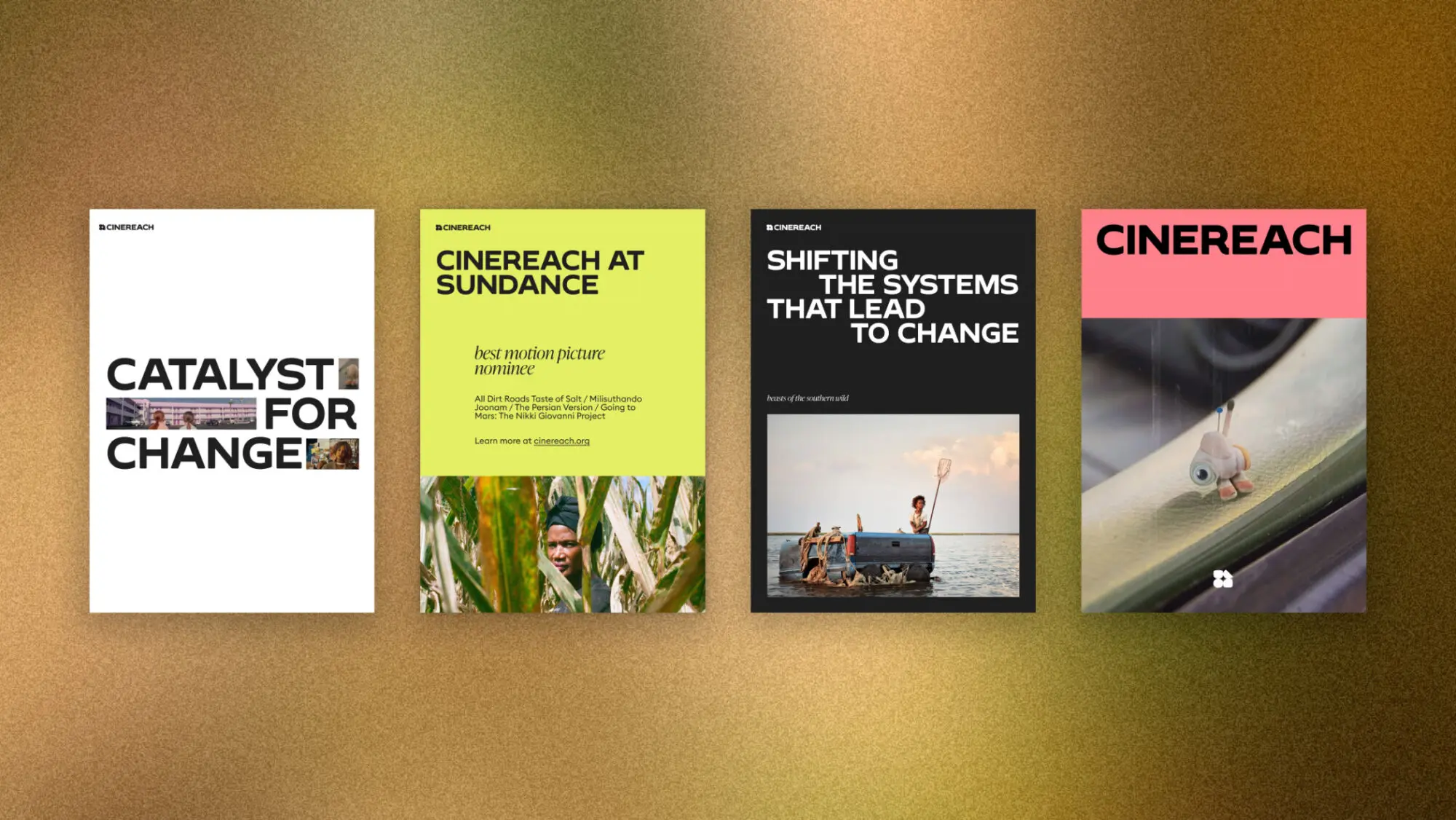
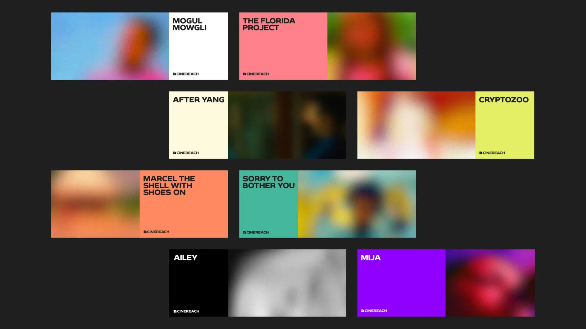
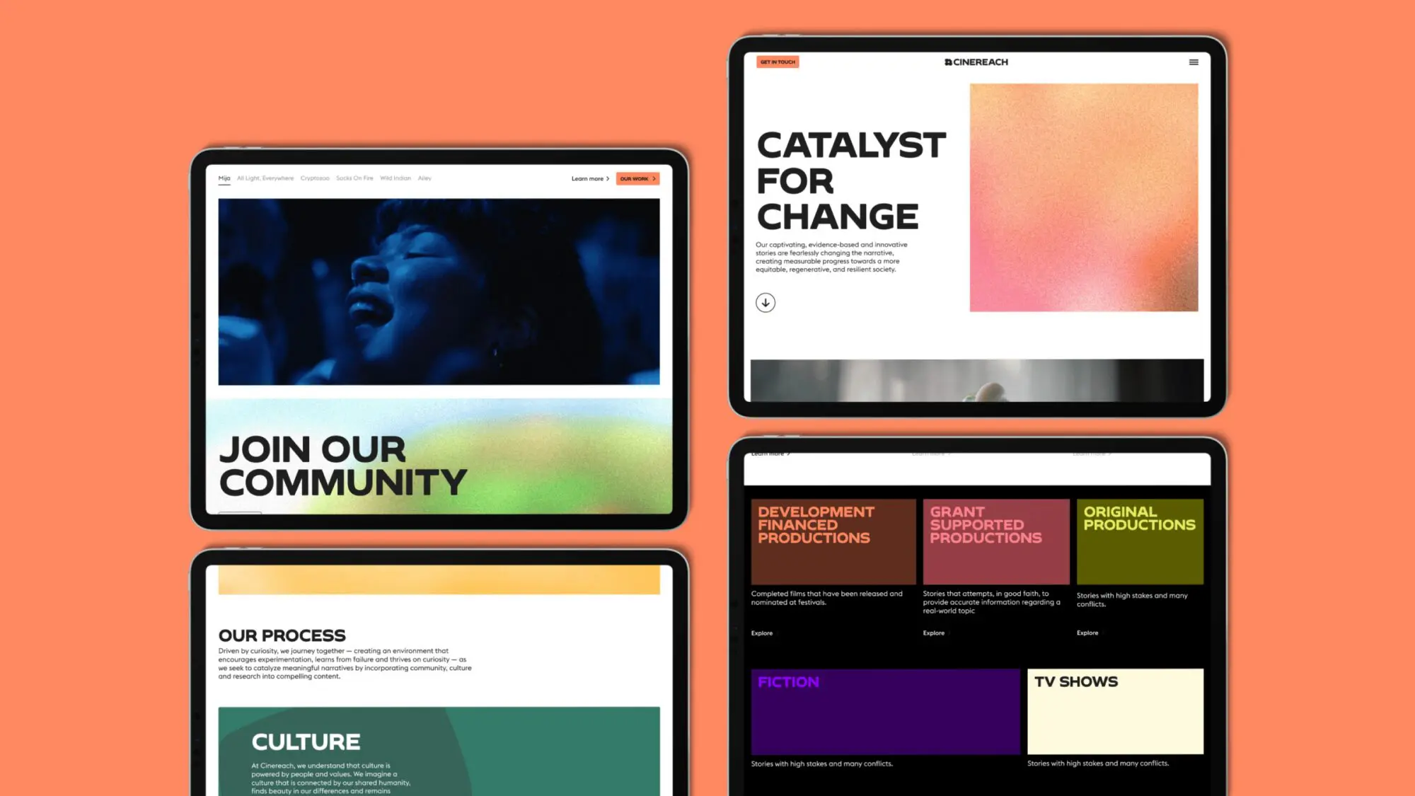
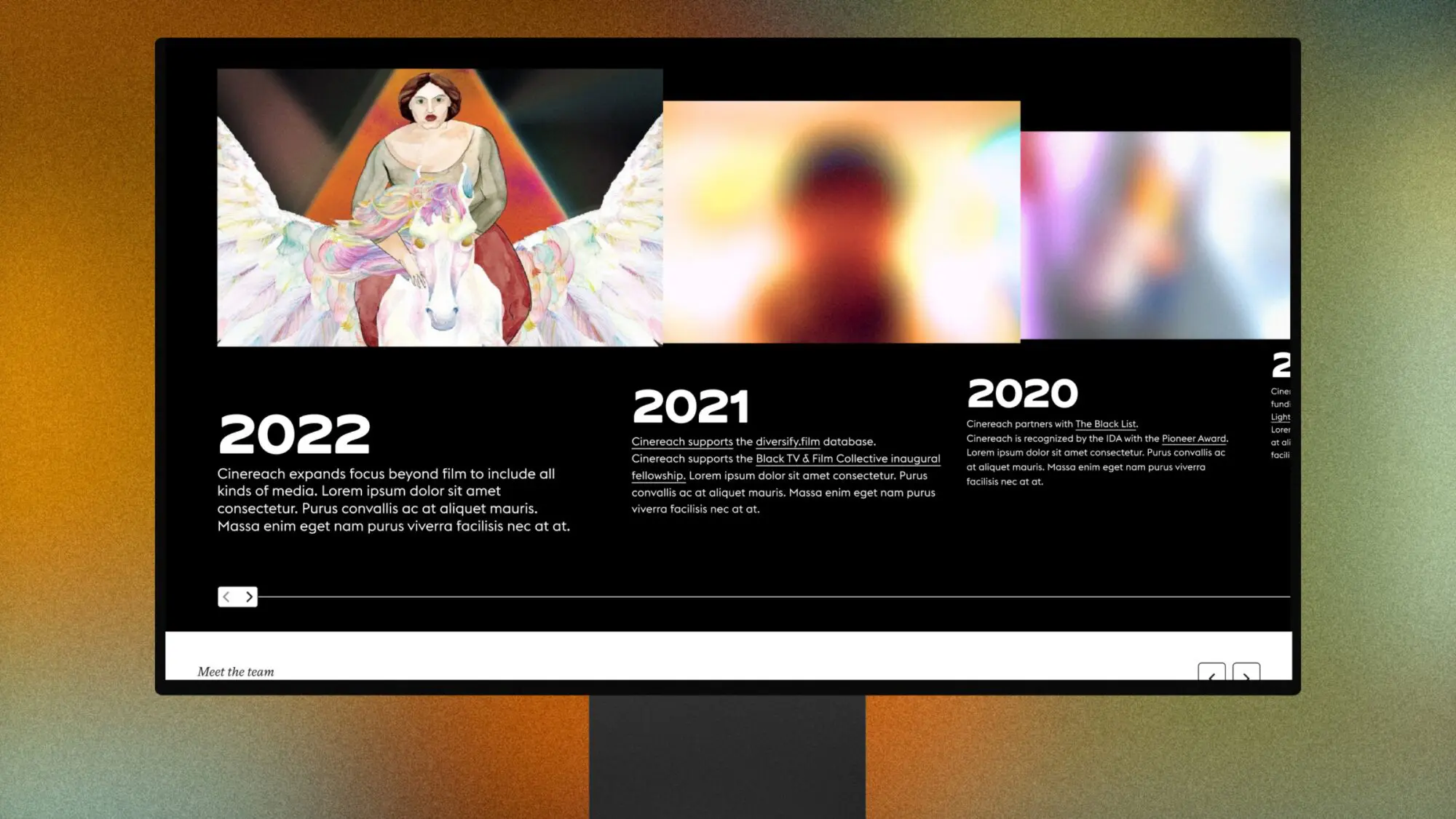
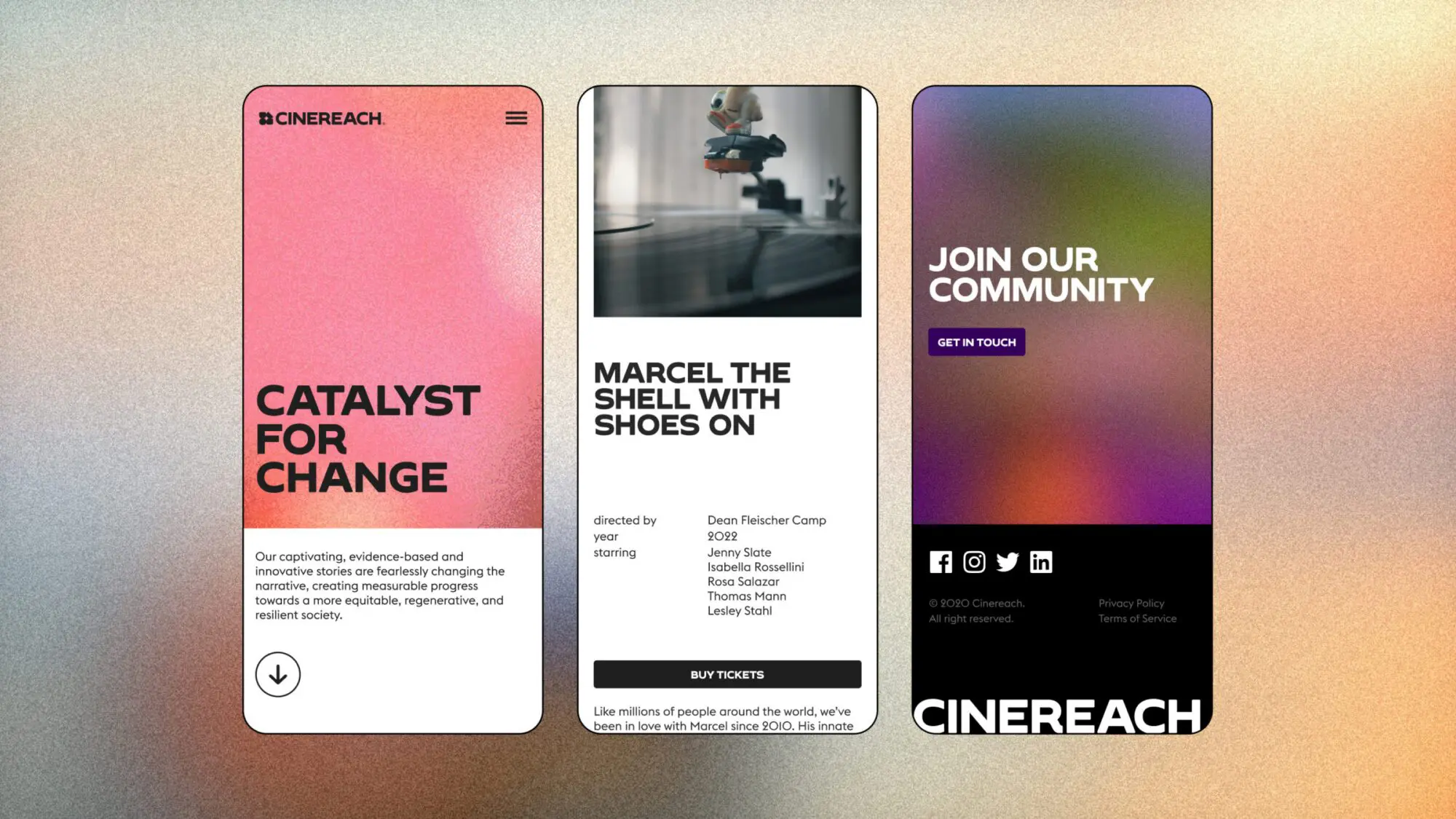
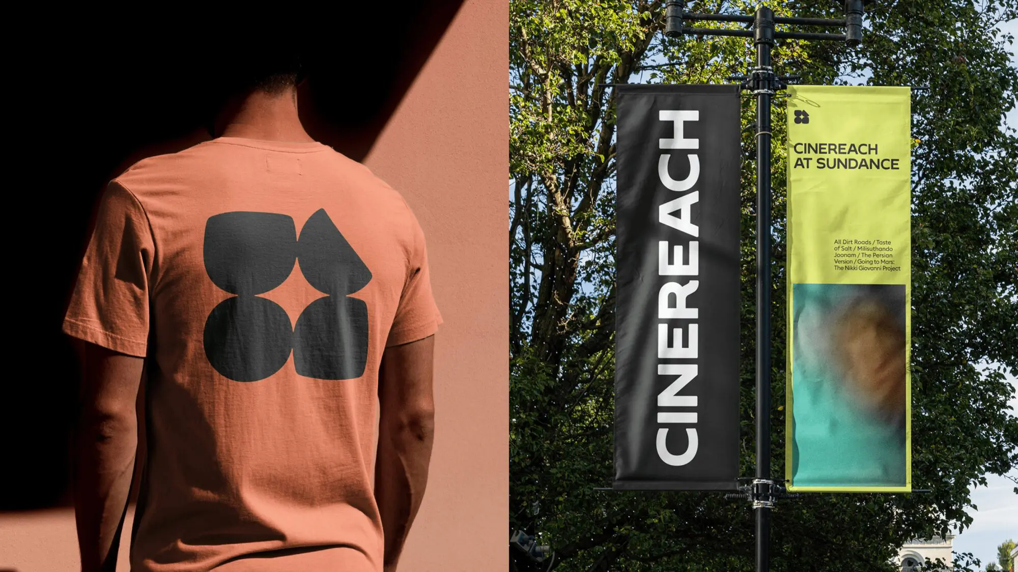
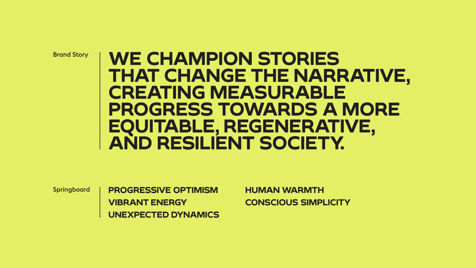
An engine for storytelling

We worked together to redefine Cinereach
as an engine for great storytelling that combines narrative change with popular entertainment while staying true to their core identity. We designed the brand to be scalable and adaptable for a variety of genres, platforms, channels, and 
distribution vehicles.

The Cinereach brand as it might look on a magazine cover. Two hands hold the magazine as though someone is reading it intently.
Mock-ups showing the brand on three films: Earth Mama by Boots Riley, All Dirts Roads Taste of Salt, directed by Raven Jackson, and Milisuthando, by Milisuthando Bongela.

Shaping a fairer society

Positioning Cinereach as a media incubator and creative playground that combines art and science with community-informed perspectives, the brand story reflects their pioneering spirit and ambition to create content that opens minds and, ultimately, helps create a fairer, more resilient society.

More examples of the new Cinereach brand in action.

An evolving identity

Inspired by the brand story, the new logo represents the melding of science, art, community, and culture to create a sparkle at the centre. To promote their visibility on screen, we distilled the identity into a moving sting.

Our graphic language uses footage and stills from acclaimed past projects to generate captivating graphic textures evocative of film. These textures are designed to be artistic expressions of the brand system, constantly evolving as Cinereach develops new means of storytelling.

A web page showing how the brand could be expressed digitally, with tiles for different films for people to watch. Titles include After Yang, Cryptozoo, and Sorry to Bother You.

Designing the online experience

After the strategy and brand phase, we helped Cinereach define their UX strategy and information architecture, and migrate their database to a new CMS. We delivered UX wireframes, UI pages and the component library – and led the implementation with our tech partner.

Various mobile and tablet devices displaying the Cinereach brand in action.
A digital timeline showing off the new brand.
Three mobile devices demonstrating the brand. On the left, the screen says

Reaching wider audiences

The rebrand marks a departure not only for Cinereach but for the film industry as a whole. They sought to break free from the cold, black-and-white, arthouse-style branding that dominates the industry and instead embrace a more colourful, playful, and approachable identity.

The impact has been significant, making Cinereach more accessible and appealing to broader audiences and a wider range of mediums beyond film.

On the left is a man wearing a T-shirt with the Cinereach symbol on the back. On the right are two large banners featuring the brand, attached to a lamppost.

“The Moving Brands team moved 
mountains in order to translate our vision 
on an expedited timeline. Their entire team was top notch from start to finish and the final product was exceptional. The team's creativity and flexibility inspired confidence in the results and we couldn't be more pleased. Moving Brands is the best of the best.”


Jennifer Strachan, CEO, Cinereach