Balancing the head and heart

In an industry beset by negative perceptions and broken promises, Exness stands out by sacrificing quick profit to do what is right
—creating and maintaining a trading ecosystem with their clients’ and partners’ best interests at heart. They combine this compassionate and principled dimension 
with data science and sophisticated models to create powerful advancements that solve traders’ problems.

Simply put, their ability to bring together the head (innovation) with the heart (care 
and integrity) makes them unique in the trading world.

Introducing The Exo

The dynamic new brand symbol brings together iconography of the head and heart seamlessly with rich 3D motion, transitioning to the two characters from the abbreviation given to them by customers—ex. These characters bridge 3D and 2D environments and evolve into a full logotype, balancing mathematically precise geometric forms with warmer lettering to evoke a sense of mind and heart working in harmony.

A desk with a pen, a screen with stock updates and a shiny 3D Exness logo on it.
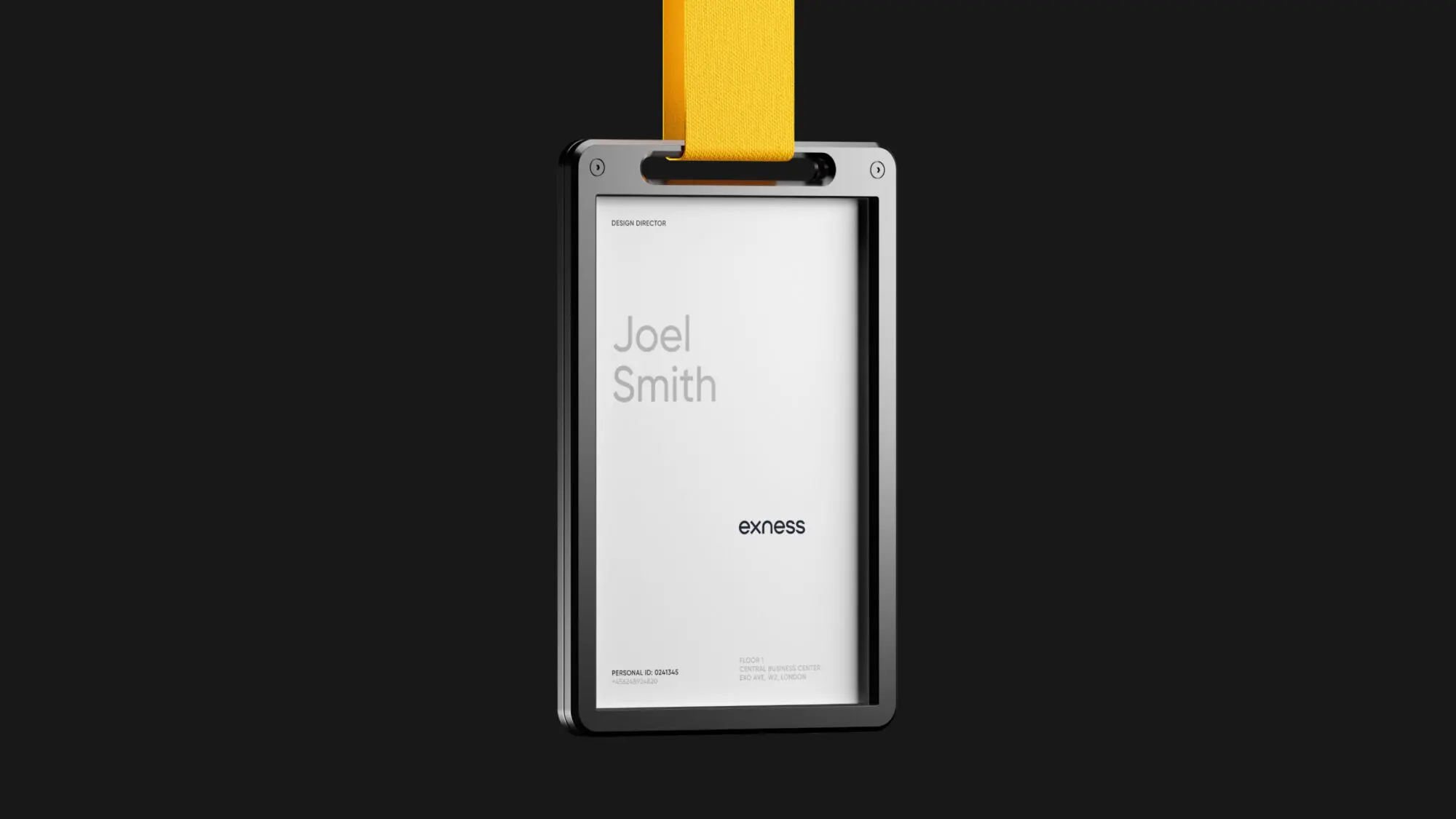
A name badge in the brand colours with the Exness wordmark on it.
The top of a iPhone home screen with the Exness app in yellow and black on it.

Inspired by the language of data

Though spread across the globe, what unites Exness traders is the common language of data. This ecosystem ranges from the micro-level of granular data points within UI up to the macro-level of infinitely complex markets.

Using circles from The Exo as a foundational element, the brand system provides a distinctive toolkit of parts for representing data—from a button within a UI component library to rich, interactive activations that bring big data to life. The result is a brand that can offer pure functionality for pro traders to perform at their best but also flex to emotionally resonate with consumers and convey the passion of trading.

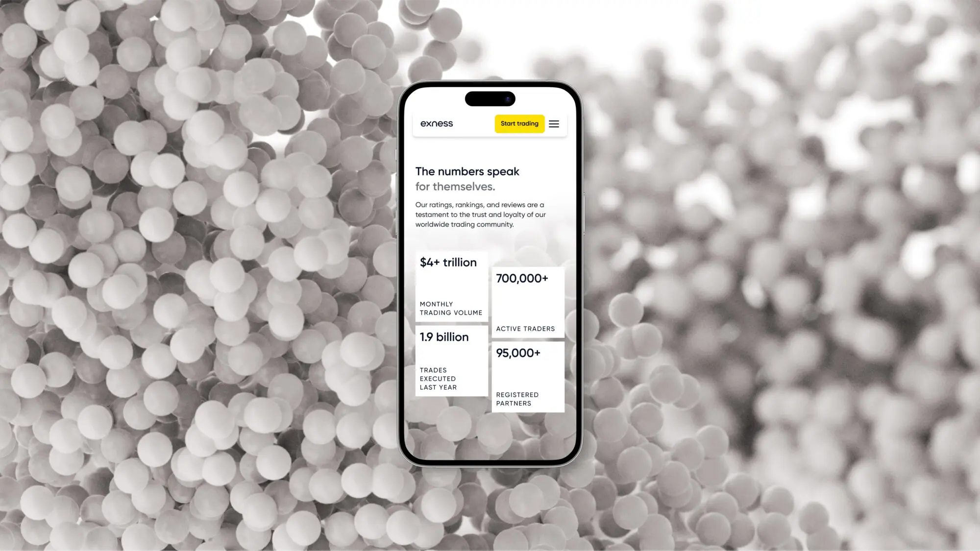
A phone on a brand texture background showing some key figures of Exness' performance on their website.
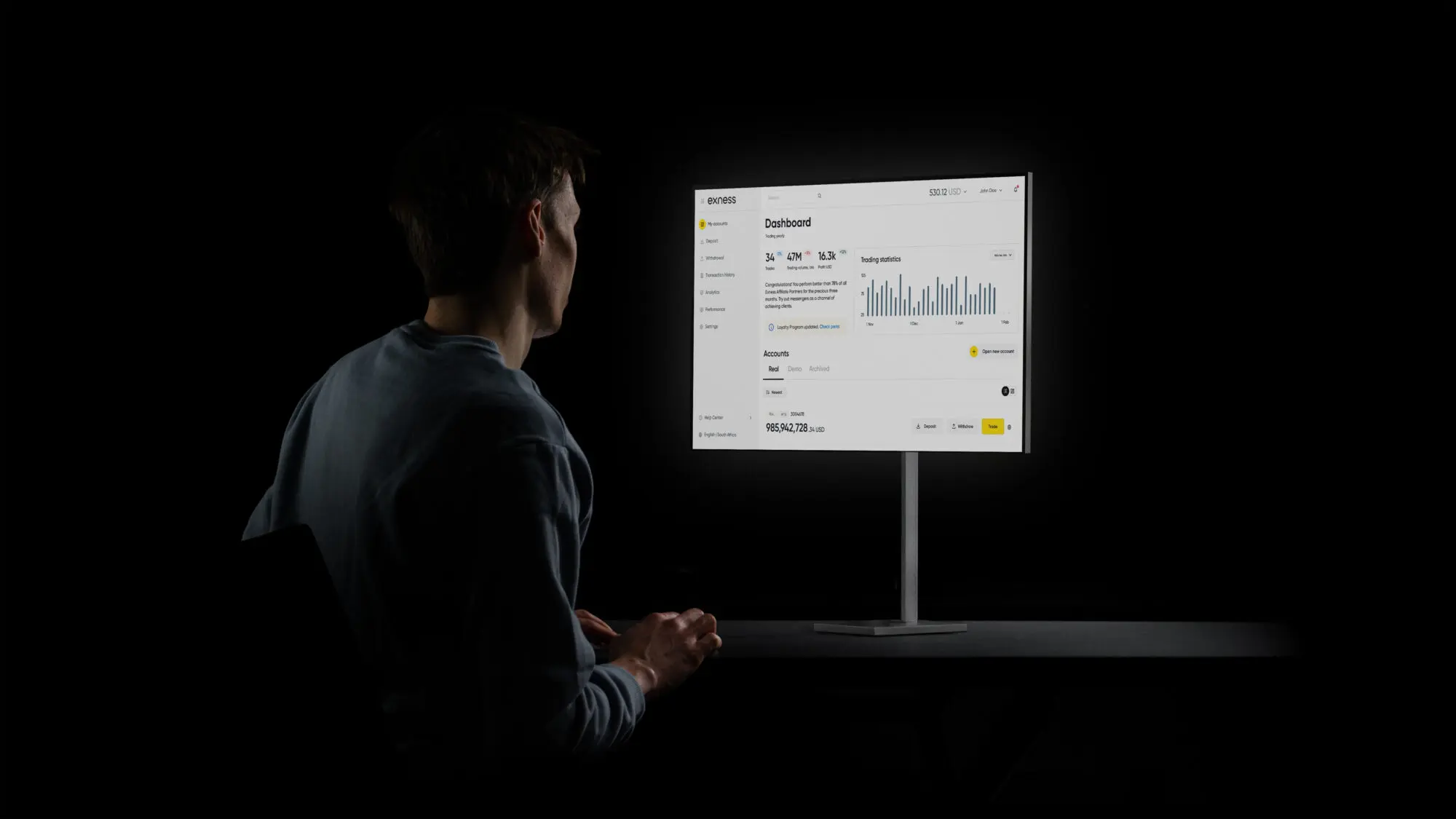
A person looking at a monitor showing a dashboard of the Exness product.
Two white leaflets on a black background with the Exness wordmark and texture on them.
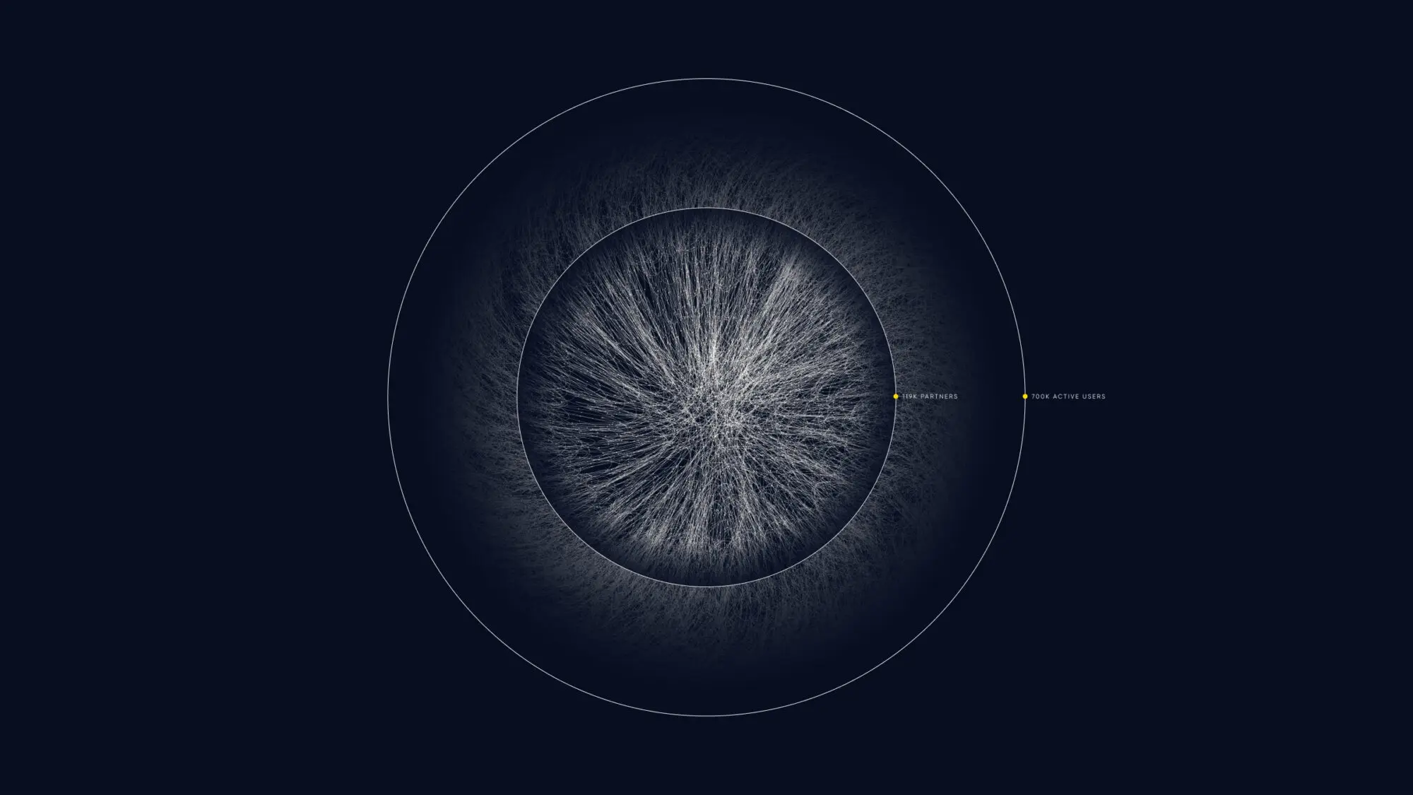
A data visualisation resembling a big network on a dark background visualising Exness' user base.
A large display surrounding a stage showing the animated brand textures visualising data.

Connecting with diverse audiences worldwide

The Exness brand sits at a parent brand level above a branded house architecture. Their sub-brands serve multiple audiences in over 150+ countries with tailored digital products.

We developed a living brand system with accompanying guidance to cater to these audiences, regions and products. With a large internal design team, our solution was to empower and inspire them with rich typographic, colour and 3D material palettes – enabling Exness to scale and adapt as the business grows.